Hi everyone, my name is Yuka Akiyama. I was one of the UI Designers on Bayonetta Origins: Cereza and the Lost Demon. In addition to the logos and fonts, I was also in charge of creating the HUD, the overall design, the loading and splash screens, and other UI hand-drawn animations. In this entry, I would like to talk to you about how we went about designing the logos for this game!
English and Japanese Logo Differences
After consulting with Nintendo, it was determined that the logo design would be handled by PlatinumGames.
Here is the completed logo! It’s used as the cover for this book on the title screen.
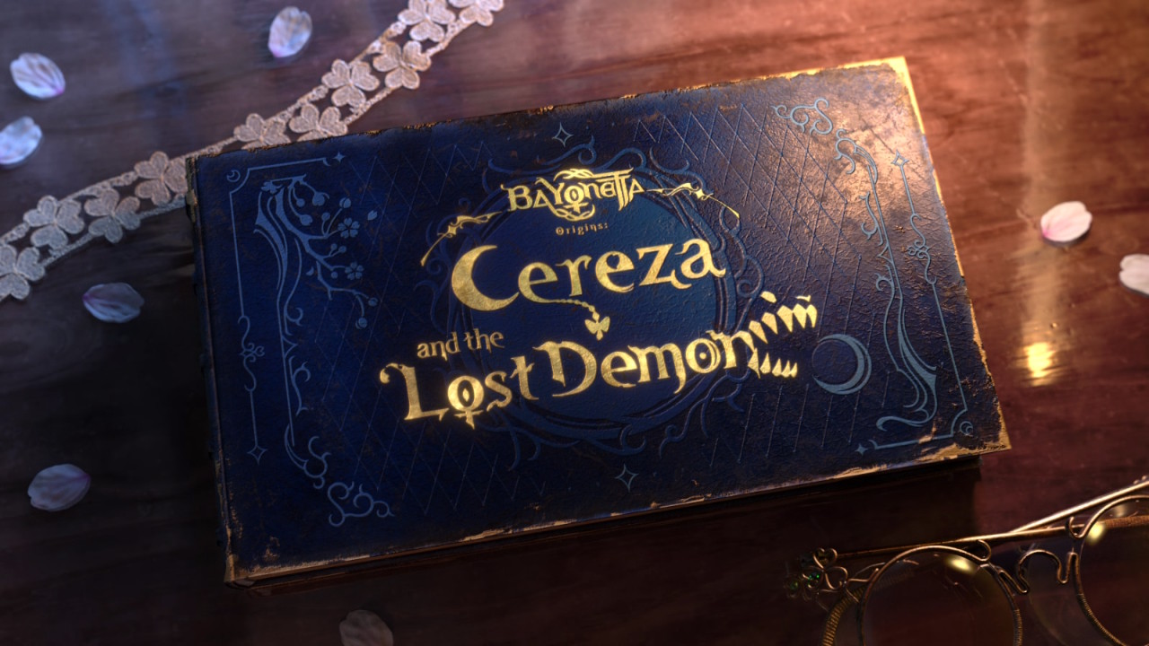 The game’s title screen
We had a good idea from the start of how we wanted the logo to look. Below is the placeholder logo that we used in the game until we came up with the final design.
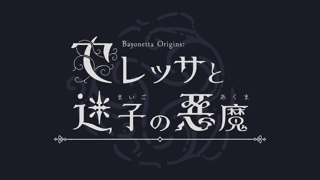 The rough logo design
We created separate logos in Japanese and English.
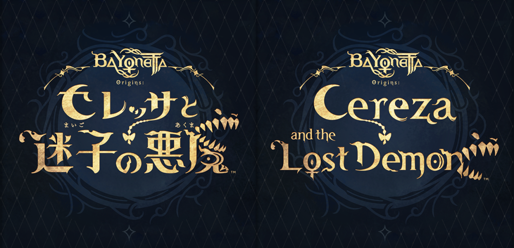 The Japanese (L) and English (R) logos
We tried to eliminate as much discrepancy between the logos as possible, endeavoring to maintain the same general outline in the design.
 Incorporating the moon and Cheshire’s face into the lettering
The most obvious components in both languages are the moon incorporated into the first character, and Cheshire’s face incorporated into the final character. We took parts directly from the mane on his character model and made the other letters appear as if they were protruding from Cheshire’s face to the left. In addition, the last character on the top line also shares a similar shape in both versions (shown in the middle in the image above).
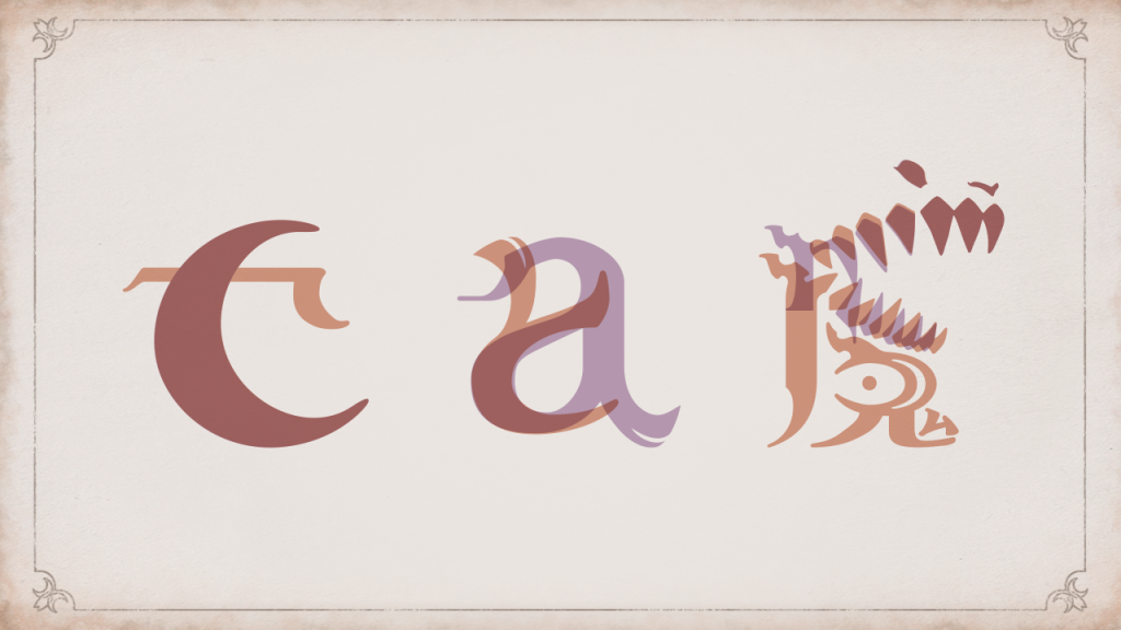
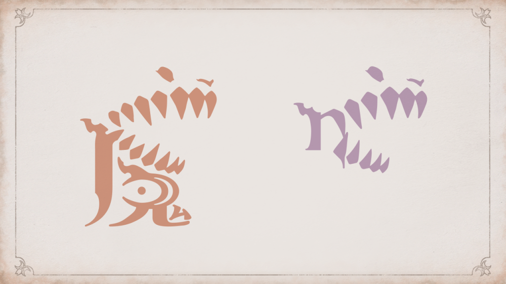 The characters above use Cheshire’s distinctive features
The top line of the main part of the logo is meant to represent Cereza and the bottom line is meant to represent Cheshire.
Cheshire’s part needed the most adjustments. This was because it should raise the question as to whether “the Lost Demon” in the title is friend or foe and therefore couldn’t swing too close either way.
We used Cheshire’s side profile, featuring his distinctive eyes and fangs, and incorporated a gaping mouth to represent his ferocity.
If you look at the image above, you can see the Japanese kanji on the left and the English letter “n” on the right. These characters are very different in size, so we didn’t want to risk losing too much of the “n” to the design. So I turned the “n” into one of his fangs so that it seamlessly connected with his mouth.
The “Bayonetta Origins:” Part of the Logo
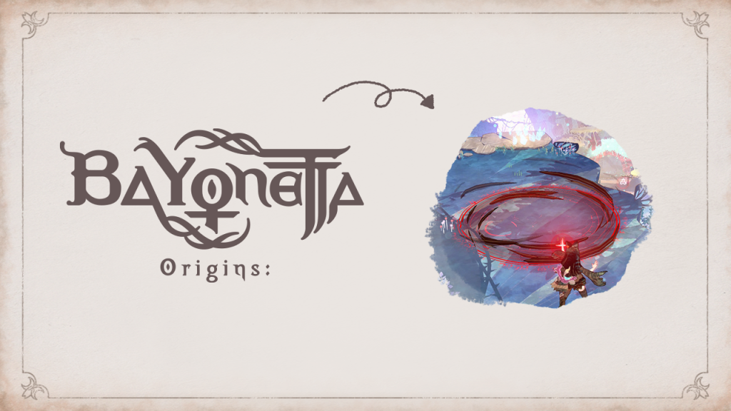 The design of the Bayonetta Origins: part of the logo
The “Bayonetta Origins:” part of the logo is different from the previous Bayonetta logos. Just like the game, the logo also represents Bayonetta’s past. We chose to use more of a “chubby” shape to express the nostalgia and childishness associated with the Bayonetta of the past. The magic circle seen in the background of the Bayonetta logos is now the tips of Cereza’s hair as she activates her magic, showing that Bayonetta is still in her infancy.
The Cereza Font
We created a new “Cereza” font for this game. The font covers accented and even Cyrillic characters!
This font doesn’t appear in the Japanese version of the game, but in non-Japanese versions you can find it mainly in headers such as enemy introductions and location displays. We kept the crescent-like curves used in the Bayonetta font and gave the Cereza font a more square-like appearance.
Team Logos
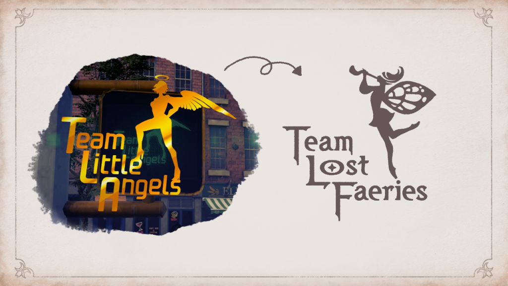 An homage to the familiar Team Little Angels logo of the Bayonetta series
If you’ve played the Bayonetta series before, you’ll probably be able to guess that the team logo for this game pays homage to the Team Little Angels logo from the mainline titles. The team logo depicts a faerie positioned on the words “Team Little Faeries”, which is lined up to resemble a staircase. The faerie is blessing the credits with her horn. This particular faerie doesn’t appear in the game itself but is rather a metaphor to denote creations handed down as lore. The faerie herself is standing en pointe just as in ballet! Speaking of faeries, you normally see the term “fairy”, right? Our director Abebe Tinari wanted to use the archaic “faerie” to accentuate the unique setting of the game. (You learn something new every day!)
In addition to this logo which pays homage to the mainline games, I had several other concepts for the logo such as a “fictional picture book publisher”, “children’s games”, and “faerie concepts created by man”. I made these concepts according to my own ideas.
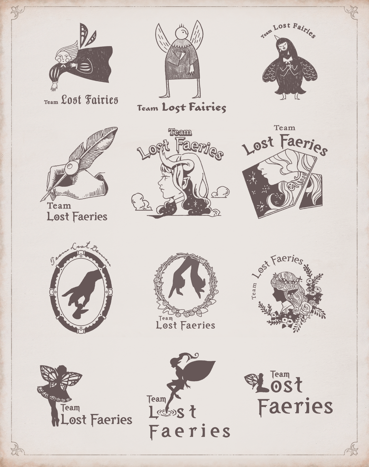 Here are some of the other ideas
In closing…
In the end I was able to create something that struck me, and I would be elated if it strikes you too!!
That’s all we have time for today, but I hope you’ll think about the logo design next time you see the game! That said, thanks so much for reading to the end!
 |
Yuka Akiyama Joined PlatinumGames in 2018. Created the BABYLON’S FONT for BABYLON’S FALL as well as icons and other graphics for ASTRAL CHAIN. For Bayonetta Origins: Cereza and the Lost Demon, she handled the logo and font design as well as part of the HUD and hand-drawn UI animations. |