
Hello, everyone. Bayonetta conceptual designer Ikumi Nakamura checking in once again. Since the last time I wrote on the blog, Bayonetta has appeared at E3, Comic Con in San Diego, and lots of other big shows. It makes you feel like the release date is really closing in. Now on August 29, we are going to have an event (in Japan) where people can try out the game called “Feel Bayonetta”. If you get the chance to attend, I hope you have a wonderful time, um, feeling… Bayonetta…
Since in my first blog I wasn’t able to talk about much, I wanted to delve further into the World of Bayonetta in my second post.
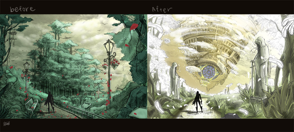
When we first started work on Bayonetta, we had this idea that the stage designs would be a shift from “the real to the heavenly.” The picture above is something that I made during that period. It would provide a good variety in the stages, and I thought that having the world change around the player would be a really fascinating idea. In the final version of Bayonetta, the background changes to a heavenly atmosphere when enemies appear, which is a remnant of the ideas from that period.
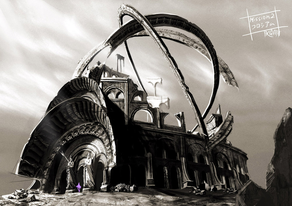
When designing for Bayonetta, I thought it would be fun to play around with the silhouettes of a scene. I used this idea for the coliseum above. Bayonetta does something here, but who she is with and what she is doing is better left unsaid. I thought the ring motif was dynamic, lending a subtle, but intellectual shape to the whole thing. I thought it would be interesting to add round parts that have celestial globe-like silhouettes to the design, so I began my design. I think I able to express the high level of sophistication the witches and sages who lived in this area possessed. However, when Kamiya-san took a look at it, he shot me down instantly…. Just kidding. He gave it his blessing, and it really put me on track for creating the remainder of the world.
I was also quite particular with my other designs outside of the realm of stages.
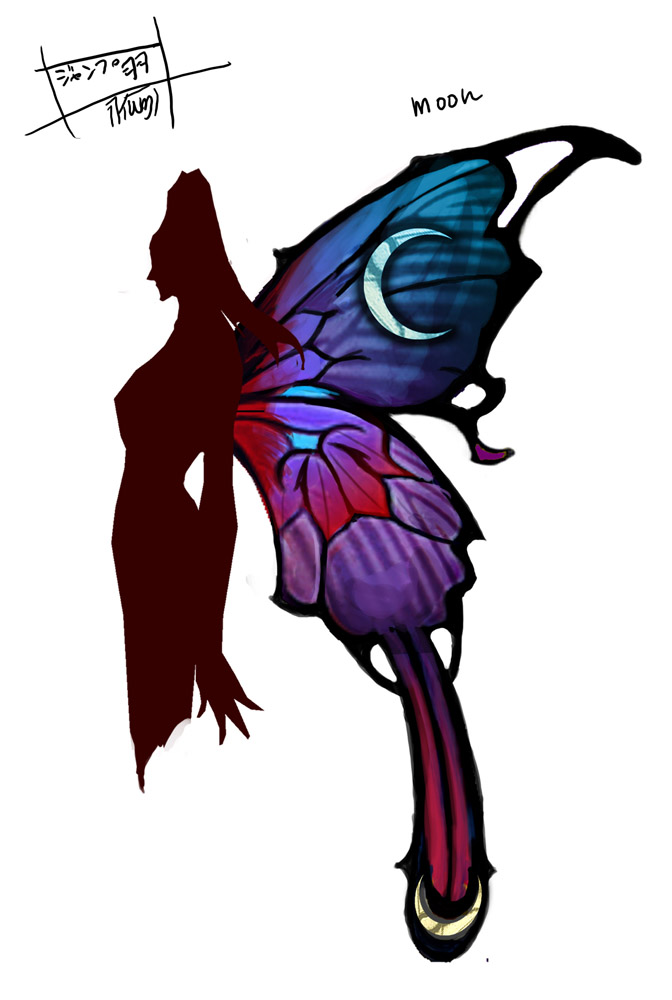
When Bayonetta jumps high into the air, these butterfly wings appear. They were designed to look like stained glass, and highlight the witches’ symbol of the moon. To really pop with her black body, I intentionally picked a color and design that would stand out. The silhouette of the wings has the same vibe as the frames on Bayonetta’s glasses. You can also see the wings in Bayonetta’s shadow.
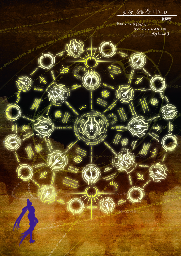
This is the magical barrier that appears along with enemies. It matches the design of the halos that float about their heads, a nod to the idea of “infinite proliferation” that I wanted to express. I would ask our special effects designer, Kudo-san, to do non-sensical things like, “Make it like it was being eaten away at by the angels from Evangelion.” But he did a great job in making it look cool.
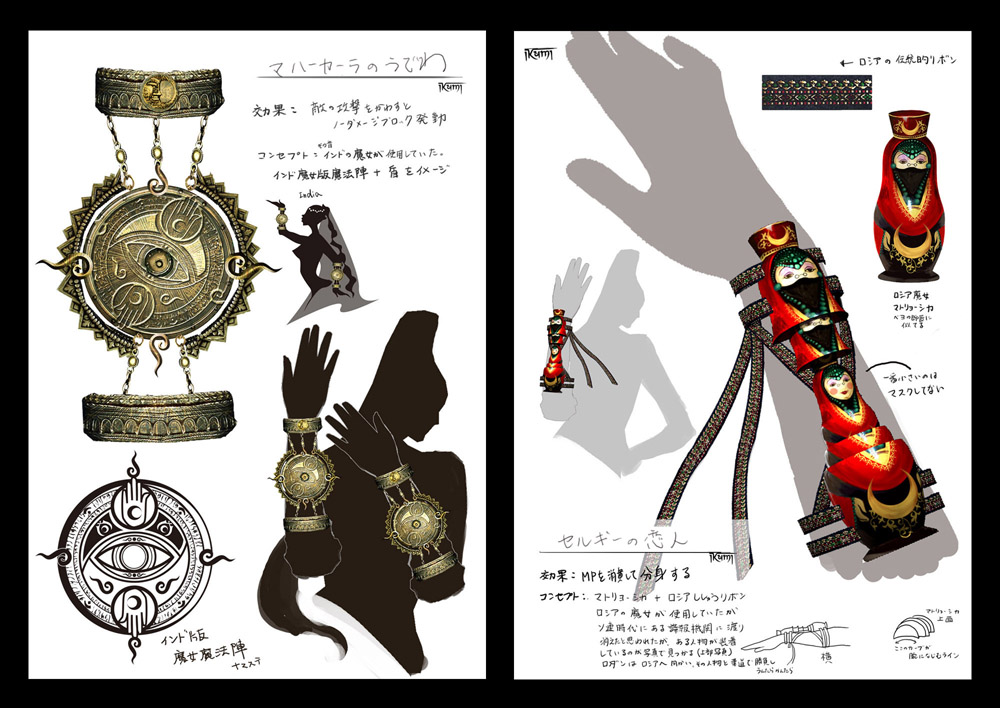
Now I’d like to touch on the particulars about the accessories that Bayonetta can purchase during the game. To start off, I had an evil plan to make Bayonetta look a bit goofy, seeing as how she is so fashion conscious. Hehe… I took my first design, “Moon of Mahaa-Kalaa” to Kamiya-san. I told him, “India is awesome. And you gotta love curry, right!” That is when we expanded the idea. We decided, “In Bayonetta’s world, there were witches around the globe since long before Bayonetta was born.” So the Moon of Mahaa-Kalaa, which is a blocking accessory of Indian origin, is made from a heavy, shield like brass material. Sergey’s Lover, is Russian, so I designed it to be eccentric, equating the idea of dopplegangers with the Russian folk art of Matryoshka dolls. The accessories actually weren’t named when I designed them, so when Kamiya-san attached the melodic name of Sergey’s Lover, I thought that he was rather high-class.
I started our with my own challenge to take Shimazaki-san’s high-art designs and throw in some interesting low-art ideas (from a game perspective), and I think they brushed me aside, and let me get away with it somewhat; however, I’m always like this, so I don’t really mind. There are tons of accessories and items in the game, so I hope you enjoy them!

The production team for Bayonetta goes by the name “Team Little Angels.” The logo is meant to be a sexy angel stepping on the letters as if they were a stairway to heaven. I designed her as if she were striking a pose. This particular pose was subject to numerous, very strict, “perv-checks” from Kamiya-san.
“The curve on her back sucks!?”
“Her butt! Her butt, I tell you!!”
“It isn’t tempting enough”
“This design doesn’t have any XXXXXXX (Censored) !?”
Etcetera, etcetera…
This logo actually ended up printed on the sleeve of the Bayonetta Tshirt we gave away at San Diego Comic Con.
Anyways, the Bayonetta world remains shrouded in mystery, but I hope to reveal a little bit more to you as we move forward.
Next time, I hope to show you some more stages and prop designs.
(NOTE: Higher resolution versions of the concept art in this post can be found on the PlatinumGames Inc. Flickr Page)