Hello, my name is Hisayoshi Kijima. I was in charge of UI in Bayonetta 2.
The UI (User Interface) division is tasked with making the overhead peripheral elements of the game that make gameplay easier for the user to understand. In layman’s terms, we design the vitality gauge, the lock-on cursor, the in-game menus, and so on.
Our general UI workflow for Bayonetta 2 was to have the lead UI artist, Mai Ohkura, determine artistic direction, and for me to execute on that vision and think about how to implement it into the game.
Ohkura was in charge of UI design in the first Bayonetta, and worked as a concept artist in Bayonetta 2, UI concepts included. My job was to analyze the strengths and weaknesses of the first game’s UI elements and work with Ohkura and the programmers to improve UI format and structure. Ultimately our goal was to keep the Bayonetta aesthetic that was established in the first game and give it a “brush up.” To the director, this meant adding more realism to the design. Mostly, this means updating the textures of your material assets, but I found it was also important to give a reason to the UI design choices you make that feels natural.
For example, in the first Bayonetta, if you take damage, your vitality gauge turns red. It’s simply systematic cause and effect. This time, in Bayonetta 2, we created a flash of red light that hits the gauge and makes it reflect red when damage is taken.
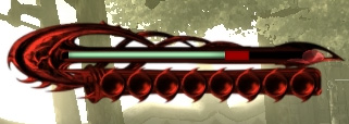
The gauge from the first game (Xbox 360)
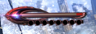
The gauge from Bayonetta 2 (now that we have a scientific reason for why the gauge is turning red, the colors have a more natural feel)
By justifying the UI this way, we felt we were able to add more realism to an inherently magical world like Bayonetta’s. Though the red light itself may come from an unnatural source such as magic, the act of the light hitting the gauge is a natural phenomenon. We used this method of thought to guide other UI design decisions in the game as well.
The shop screen from the previous game
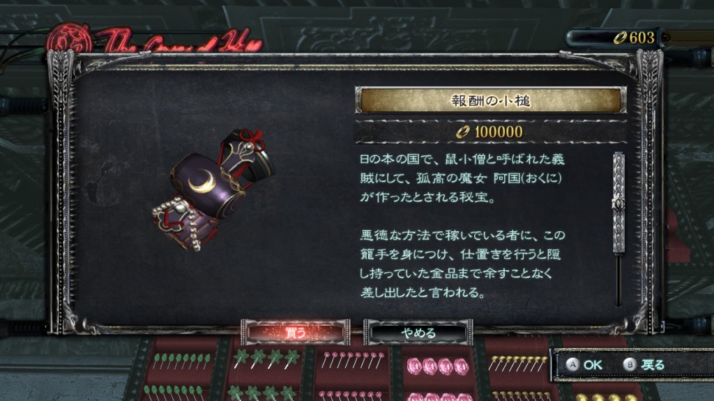
Shop screen from Bayonetta 2 (layout/animation redesigned to place more emphasis on item images, making the items look like real objects vs. thumbnails)
In the previous Bayonetta, UI would use a lens flare animation effect in certain situations, and each of these situations was designed separately. In Bayonetta 2, we made every instance of lens flare to be horizontal anamorphic, so it would look like it was all taken with the same lens. We did this everywhere except in special cases we intentionally wanted to be different, such as healing animations, etc.
Horizontal anamorphic lens flare. This appears on the vitality gauge, the combo meter, confirming something within a menu, and so on.
Another goal of the UI team was to incorporate a look into the design unique to Bayonetta 2’s aesthetic. In the previous Bayonetta, the UI design included a lot of curvature, which was influenced by the heavy presence of Paradiso in the game. In Bayonetta 2, we made the lines more rigid and gave the overall palette a colder feel (the Result Screen below is an easy to understand example).
If the previous game’s UI design was based off of Paradiso, what influenced the UI design in this game? You’ll just have to play Bayonetta 2 and try to figure it out yourself 🙂
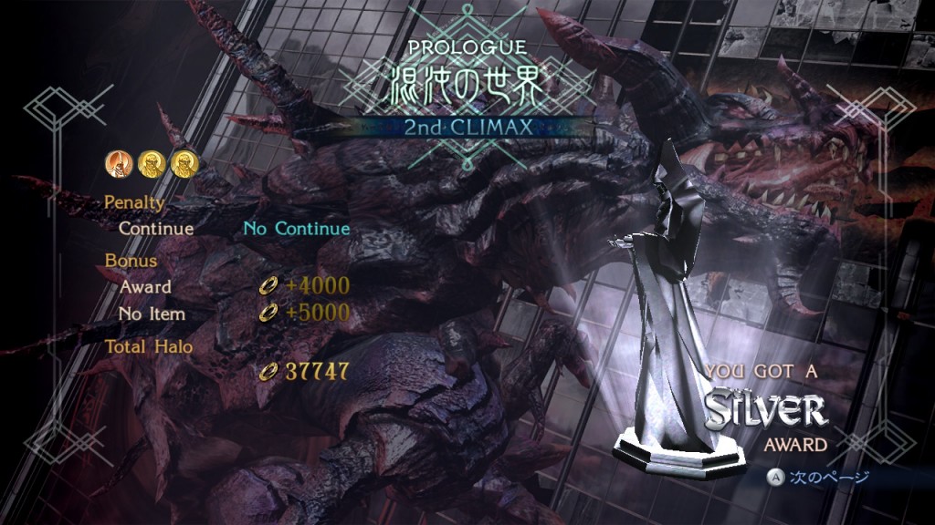
I also felt it was my duty to clean up some of the harder to understand UI from the original. One example of this is the Result Screen. I changed the size and layout of the result screen for Bayonetta 2 and split the info up across two screens, which I think made things a little easier to comprehend. I also decided to put an image of a halo next to all halo-related numbers (currency in Bayonetta 2) so points and money were easier to differentiate.
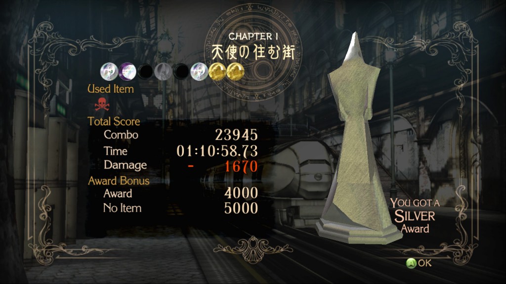
The Chapter Result Screen from the original Bayonetta
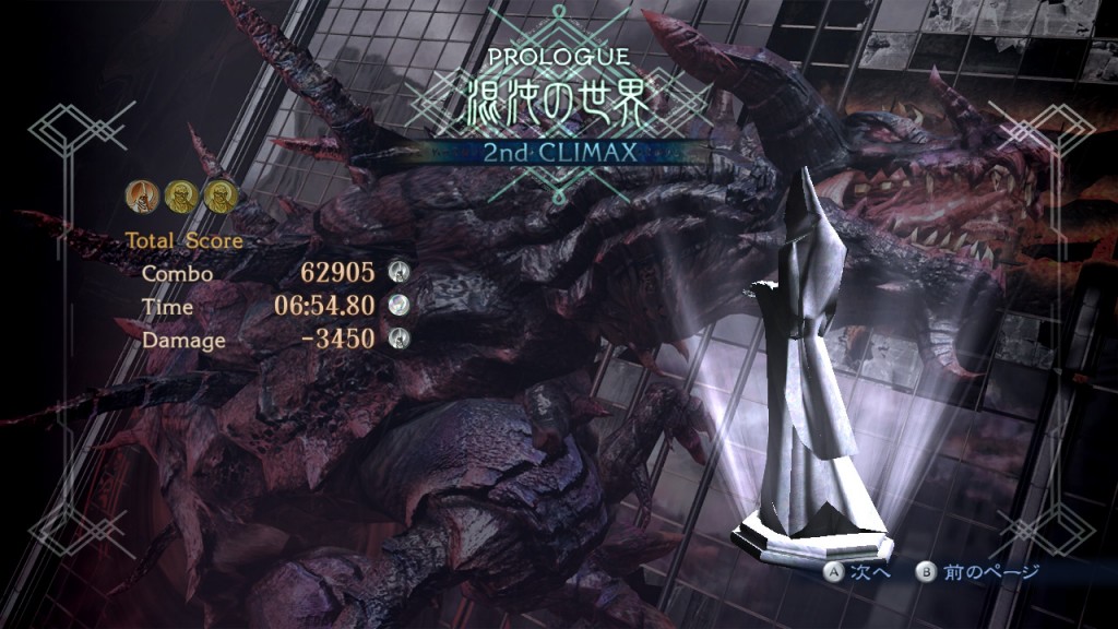
The newly revised Chapter Result Screen in Bayonetta 2 (the first page is for award related items, the second page is for non-related items)
To improve on the feel of controls, I employed the easing technique common in recent web design: a quick start with a gradual finish. Applying this technique to UI animation gave the game’s controls a better feel. I think it helped give more realism to the game as well. To get academic for a second, easing is based on the law of uniform motion, which is like how a car starts and stops. A car takes time to build up to a certain speed, then gradually slows down to a stop. Having UI animation work off this concept gave controls a more natural and thereby ultimately better feel.
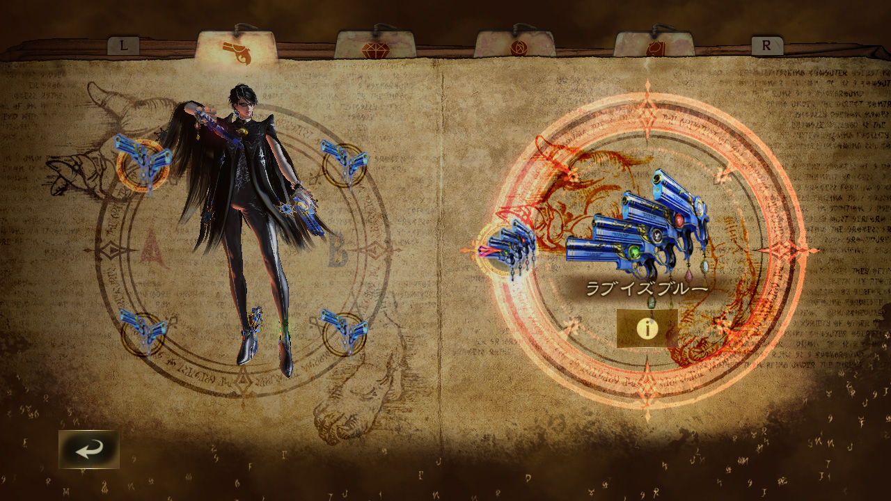
One of the more difficult UI issues was figuring out how the cursor within the game’s submenus should behave. There were two camps as to what we should do, and finding the right balance took a lot of trial and error. My priorities were developing something intuitive that has a good feel, and is easy to get right off the bat. Other members of the team thought it was more important to create motion similar to what players are accustomed to. Eventually, we were able to take the greatest common factors of both sides and create a feel that I think everyone on the team was happy with.
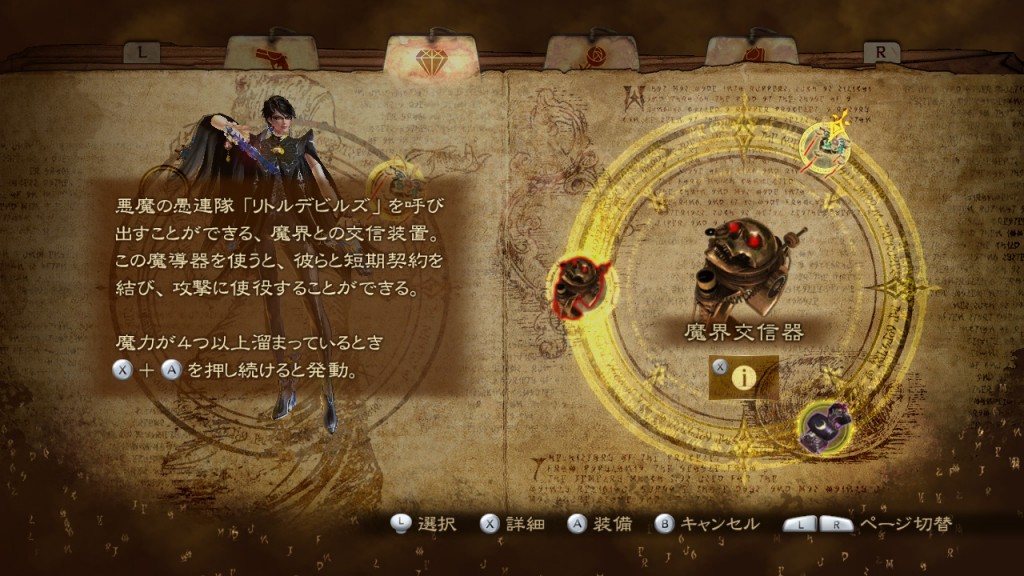
A submenu (the cursor moves along the magic circle, swinging from item to item)
The submenu using touch controls (one tap will replace the bottom right button explanations with the “back” button at the bottom left)
Finally, as this game is a Wii U title, it includes touch controls. When designing menus for button and touch controls, it takes a lot of work to find a good balance between functionality and attractive visuals. If you get too carried away, you can tweak endlessly without ever finishing. In the end, we decided to make sure that button controls had the right feel, and then moved on to touch controls, making sure nothing felt off. A lot of small adjustments were necessary for making the design and input of touch controls as uniform throughout the game as possible, but by the time we were finished, I think we were able to create controls that players will enjoy trying out. It’s not all about aligning cursors and then inputting commands like it is with regular buttons, you just give a quick tap and you’re done, so sometimes it ends up being pretty convenient. Even for the more orthodox gamers, I suggest you give it a try!
That’s all for my blog. I hope I was able to get across how things have leveled up since the original. Please enjoy Bayonetta 2, UI design included!