Hello, my name is Mai Okura, I was the conceptual designer for Bayonetta 2. For the previous game, I was in my first year working at Platinum and in charge of its user interface (maps, menus, gauges, etc.). I remember giving then-producer now-director Hashimoto a lot of stress, so it was a bit of a surprise he let me back on his team. Those two games really mean a lot to me.
But anyway. You’re probably still stuck on the title “conceptual designer”, wondering what it means. Yeah, it’s a bit of a toughie. Games and movies as well often have several smaller parts that come together to form that game’s overall look and feel. This can include characters, enemies, environments, and UI too. It’s my job to create a style guide for all of these individual pieces and make sure they make sense when placed together.
This wasn’t my job in the first game, but I worked on UI under the conceptual designer and learned a lot about how important it is to have each of the game’s concepts working together to construct overall world design. I’m still pretty new at concept design and not doing anything that jaw-dropping at the moment, but I thought I’d try to take this blog as an opportunity to talk about what I think is really fascinating about Bayonetta 2.
There are two topics I’d like to touch on. The first one deals with the image below.
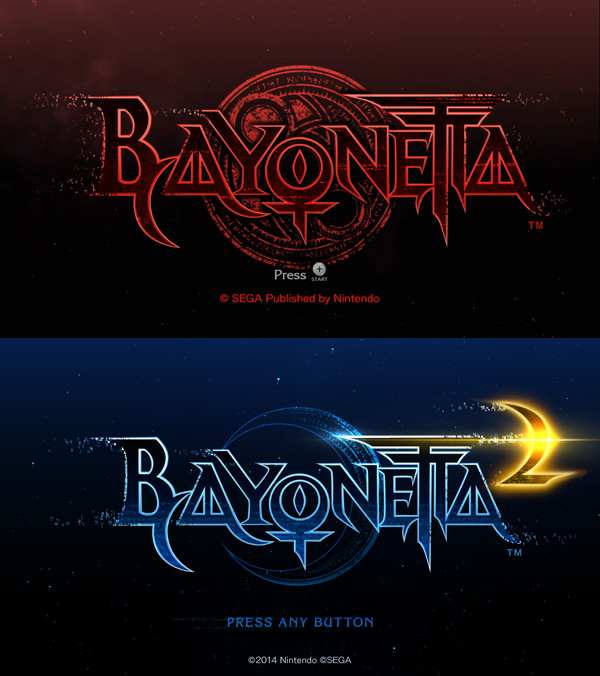
As you can see, the base tones for the original Bayonetta were red and black, whereas in Bayonetta 2 they’re blue (representing Bayonetta) and gold (representing the game’s enemies). Compared to the image above it, you can tell the bottom screen gives off a much brighter, vivid impression.
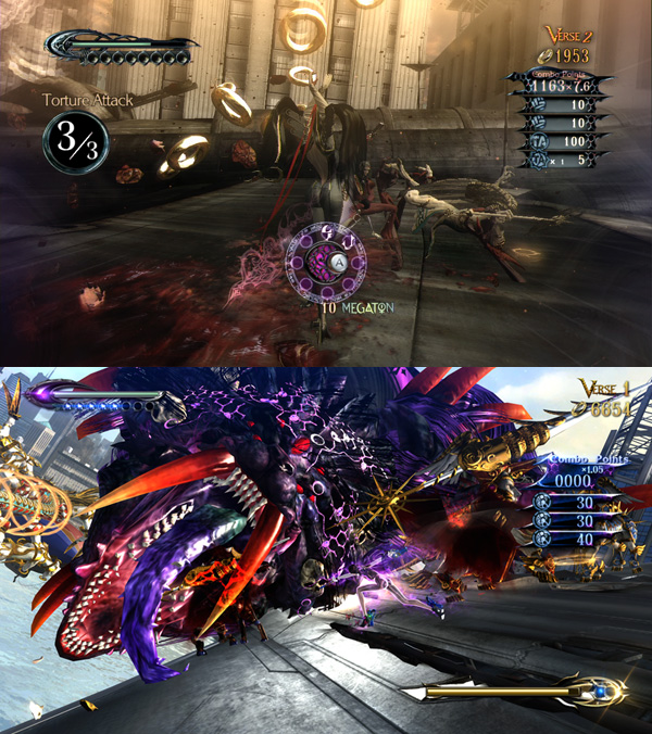
What was so difficult about this was that while Bayonetta’s key color was blue, the key color for Aesir’s power was blue as well. Ultimately we resolved this issue by changing this mysterious power of Aesir’s to an emerald green, but it’s still kind of hard for players to discern, so I gave Aesir his own unique line patterns in his design to draw distinction from Bayonetta.
The second point I wanted to talk about was how much contrast changed between the two games. The first game has relatively low contrast, whereas colors in Bayonetta 2 are much brighter stand out a lot more. In the original Bayonetta, a lot of our inspiration was drawn from the classical architecture and landscape of Europe: you could see a lot of the curved lines in the works of Mucha and Gaudi, and things had an elegant Art Nouveau tone.
(Top: Bayonetta/Bottom: Bayonetta 2)
In Bayonetta 2, however, there is a much stronger theme of straight lines and geometric shapes, as you can see looking at Aesir. There are also a lot more colors in this game in total; in Bayonetta and the other characters, the effects, and the UI as well. This might just be because Bayonetta 2 has more characters than the previous game. Looking at the two games side by side, I think you can admit that Bayonetta 2 has a more modern feel, whereas the first game feel’s more classic.
There’s a lot more I realize I could write… but I think I’ll stop here.
They may be the same series featuring the same main character, but there’s a lot in the world design of Bayonetta 2 that you won’t find in the original, and vice versa.
Take care!
*The official art book for Bayonetta 2, “The Eyes of Bayonetta 2”, goes on sale in Japan tomorrow! It includes concept art, 3D character models, the Hierarchy of Laguna, Lemegeton’s Guidebook, comments from the staff, and art from me! Be sure to take check it out!