Hello! Hisayoshi Kijima here again. You may remember from my previous devblog that I designed the UI for NieR:Automata, but that wasn’t my only job. I also worked on the mecha designs. I’m very passionate about mecha design – to the point that director YOKO TARO was afraid I’d put all my focus on that and slack off on the UI. (I promise I gave the UI my full attention, too!)
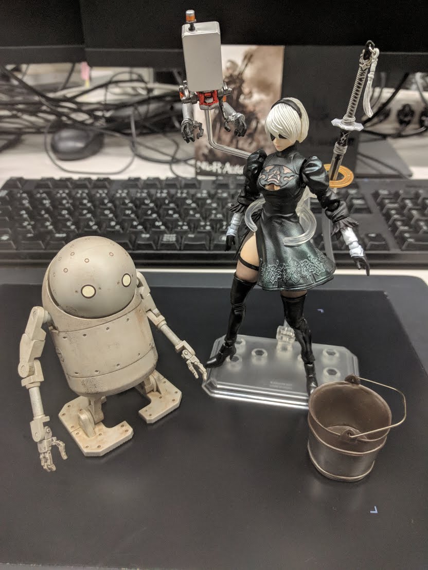
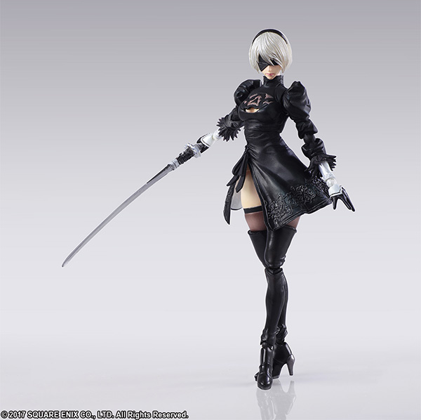
I’m glad to be back with my second NieR:Automata devblog. And I figured, since some fancy new 2B and Machine Lifeform figures just hit the shelves, what better time to share my mechanical design process with all of you?
Full disclosure: I get carried away when I talk about mecha design! But I’ll try to include as many images as I can to keep things easy to understand.
Machine Lifeform Concepts: Taking Shape
As I worked on early concept designs for the Machine Lifeforms of NieR:Automata, YOKO-san gave me a few rules to follow:
- Make them cute enough to appeal to all sorts of players
- Make them a little unbalanced, to show they’ve got character
- Make them rough, retro and a little dirty
- Make them modular, assembled from similar units to look like a cohesive force
With these rules firmly in mind, I started sketching. But I just wasn’t satisfied – I couldn’t come up with anything that met my own ideas of what a NIER-ish design should be.
“Actually,” YOKO-san told me, “I’d rather you didn’t think too much about the designs from the original NIER.” Still, I started playing with silhouettes inspired by the distinctive motif of Emil from the first game. You can see some of them at the bottom left of this page from my sketchbook:
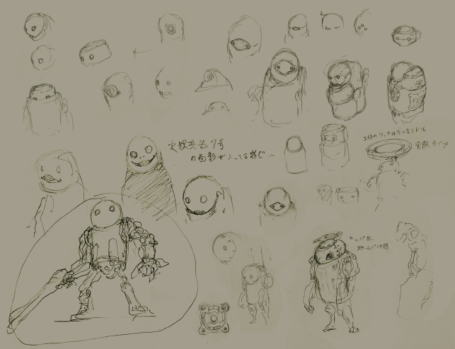
These designs really clicked with me, but I was still surprised when YOKO-san and the other staff around me immediately gave them the nod of approval.
To digress for a second, at this point in production, I gave the Machine Lifeforms an Emil-like appearance because I was imagining a sort of convergent evolution.
Convergent evolution is the natural phenomenon of animals from completely different evolutionary backgrounds adapting into similar forms. (Bats and birds, for example.) This is fudging the science a little bit, but my theory was that, perhaps in the world of NIER, all attempts to make the most powerful weapon possible would eventually lead to something like Emil – that his form would be the “fittest.” (Again, this isn’t canon! Just an idea behind my early designs.)
I also came up with a few ideas of my own about how the Machine Lifeforms should move, and how they’d be put together, from a mechanical perspective. Of course, I did this for my own amusement, but it’s also an important part of my process that helps me come up with a coherent mechanical design.
Machine Lifeform Concepts: Development and Polish
Soon it was time to take these preliminary sketches and build them up into the adorable Machine Lifeforms we all know and love. I tried to make my designs meet a couple of goals:
- Stick to simple, symbolic characteristics, that even a kid could draw
- Make their silhouette easy to understand
At some point along the way, I gave the Machine Lifeforms eyes and mouths. However, I eventually decided that a simple, subtractive design would make their personalities stand out the most. I chipped away at my designs, removing details until only the bare necessities were left.
I think the result is a design that, through its simplicity, conveys a lot of different expressions to suit the situation – sometimes cute, sometimes menacing.
By the way, I applied similar “subtractive design” principles later on in development, when I was called on to design the user interface.
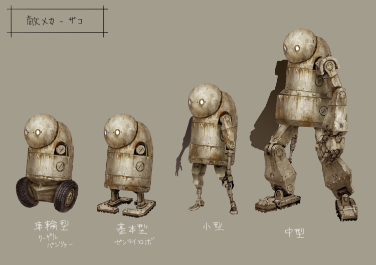
The director OKed my design and I moved on to the next stage: sketching out variations for several different enemy types, built out of different modular parts.
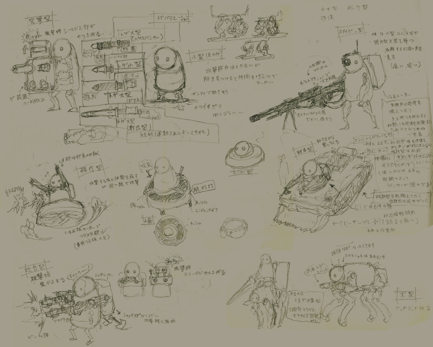
These sketches went over well with the team, and became part of a lively discussion about potential setting details and gameplay. Lots of those ideas made their way into the final game. This is probably the most fun stage of the entire game development process.
YOKO-san had only one specific requirement for my designs: Avoid parts that curve along three axes. That may be hard to visualize, so let me show you:
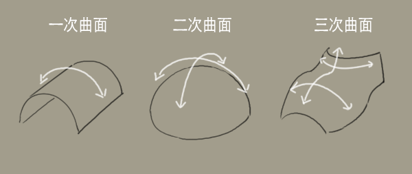 From left to right: Parts that curve along one, two and three axes. The part on the right is no good, apparently.
He told me this would make sure that the Machine Lifeforms looked retro and unique. But I was afraid it might result in nothing but bland shapes. When he first said it, I thought, “That just sounds unreasonable…”
Working around that direction from YOKO-san was easily the hardest part of designing the Machine Lifeforms. But with a few little twists and tweaks, I think I ended up with some charming yet simple shapes.
Machine Lifeform Concepts: Making them complete characters
As I arrived at the final designs, I added a special detail to the Machine Lifeforms: their unique connector cover design.
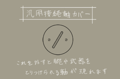 Machine Lifeform connector cover. These covers can be screwed off to reveal contact points where Machine Lifeforms can attach arms, weapons and more.
I wanted this design to be something of a Machine Lifeform symbol – if you see one of these, you’re looking at a Machine Lifeform. On top of that, they also made for good places to stick on weapons and so on – making the Machines look nice and modular.
The Machine Lifeforms themselves may have simple bodies, but their weapons are a different story. I set them apart by giving them rugged, detailed designs. I was aiming to create a bit of visual dissonance between the Machines’ cute faces and fearsome weaponry, to make them feel off-putting and dangerous.
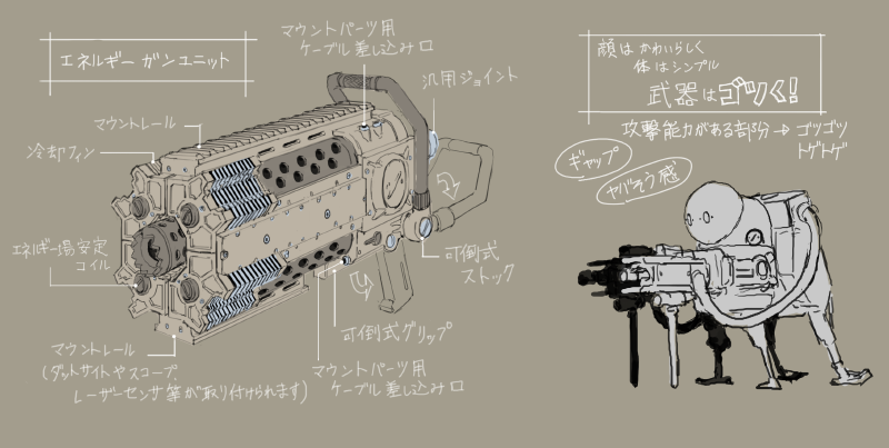 Machine Lifeforms have cute faces, simple bodies, and serious weaponry! Their dangerous bits are detailed, chunky and sharp. The dissonance between their base bodies and weapons makes them feel even more dangerous.
After I had my designs in mind, I had a chance to look at the gameplay, offer my thoughts, and consider what sort of animations would bring out even more personality in the Machine Lifeforms. Some of those suggestions made their way into my design sketches:
Blinking – Or, technically, opening and shutting their camera covers.
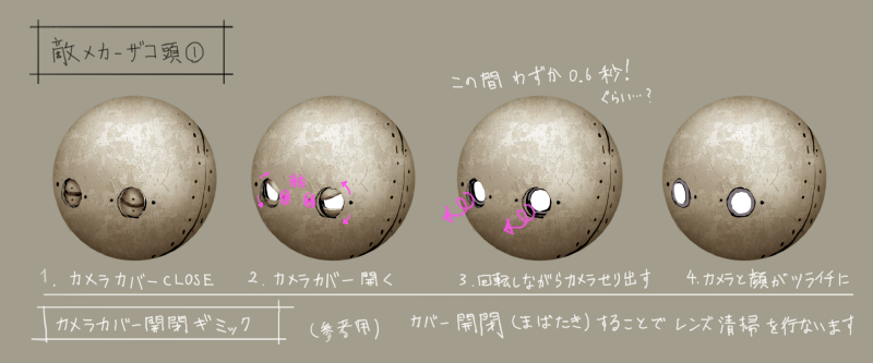 Here’s a reference for the Machines’ “blinking” movement. They shut and open their eyelids – which are actually camera covers – to clean off their optical sensors.
Birdlike Head Movements – Having such a massive enemy tilt its head like this is a little cute, and a little creepy.
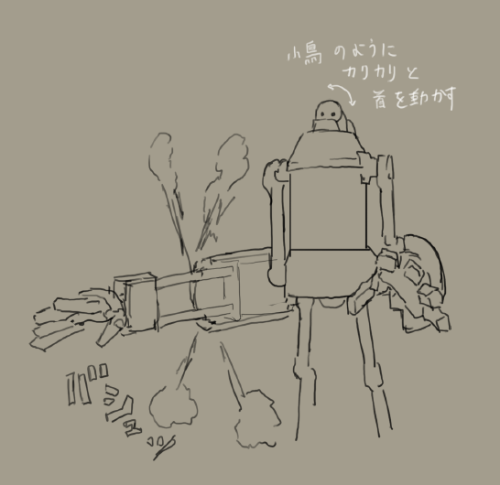 This big guy’s head twitches side to side, like a small bird’s.
I think it’s the little movements like these that really make the Machine Lifeforms feel gentle and alive, despite their solid, inorganic bodies. Watch for them in-game!
In addition to their designs, the personalities and dialogue that YOKO-san came up with really made the Machine Lifeforms into something more than cannon-fodder enemies. I’m amazed how popular they turned out to be among NieR:Automata fans.
Attention to Mechanical Detail
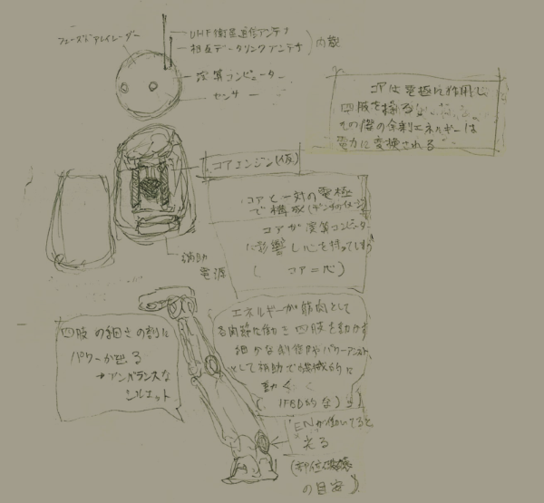
Once I’d established the Machine Lifeforms as likeable characters, it was time to add some details to please the mecha fanatics – including myself! I was given a surprising amount of freedom to do this. (Of course, I had to say I was doing it to make the world more realistic and visually interesting…)
Borrowing motifs from real-world machinery and weapons
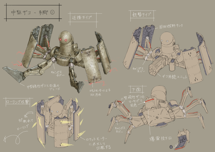
In the world of NieR:Automata, the Machine Lifeforms are high-tech soldiers built by aliens, but they mimic human culture from the past. To show this, I built them out across a mix of technological levels, spanning from World War I to the present day.
But they couldn’t just look warped and strange – they also had to be believable. I looked at actual, existing strange machinery and unusual weapons for reference; peculiar design concepts that were nonetheless intended for real-world use at some point in history.
These references paid out in spades, and I was able to work out all the mechanical motifs I could dream of, while also creating unique silhouettes and strange gimmicks that added to the Machines’ sense of character.
Attention to joint structures
Mecha design is a war against joints. That’s how I see it, at least. Joints are a difficult but important part of robotics design, so I’d like to go into some detail about them now.
I explored two main concepts as I designed the joints for the Mechanical Lifeforms.
1. High mobility from single-axis offset joints
Most robots, real or fictional, don’t have soft, flexible bodies like humans do. That means that means that joints that only bend along one axis can only bend so far before the robot’s parts bump into each other, like so:
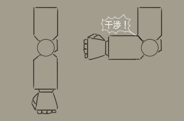 Arm parts bump against each other as the joint bends.
Most mecha designs get around this and open up a wider range of movement by using double-joints, as shown here:
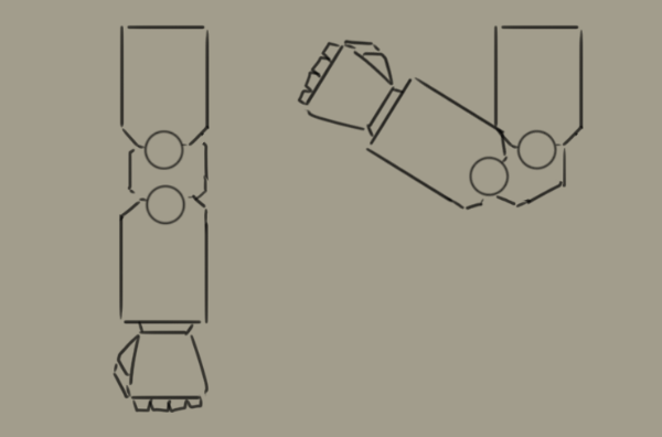
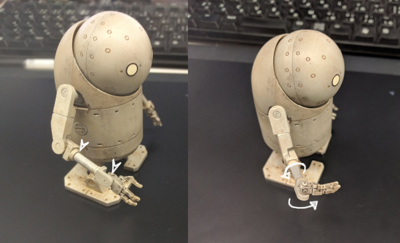
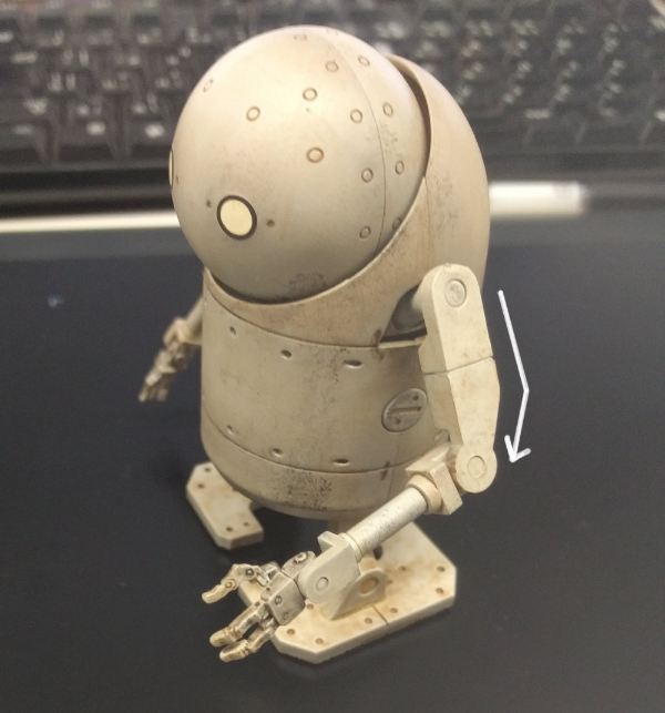
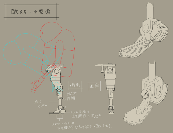
But NieR:Automata’s Machine Lifeforms are different. Instead, I gave them single-axis offset joints. I shifted the point where the joints themselves connect to cut down on parts interfering with each other and increase their range of motion. (See how this Machine’s elbow is lower and off-center from the rest of the arm?)
This is a very simple joint structure, so I thought it was a good fit for the retro-styled Machine Lifeforms. The simplicity also makes the joint look rugged and easy to maintain – both great qualities for a robotic soldier!
By the way, from our animators’ perspective, these joints are also much easier to work with than double joints. That’s always a plus when you’re designing mecha for games.
2. Combining single-axis joints for more movement
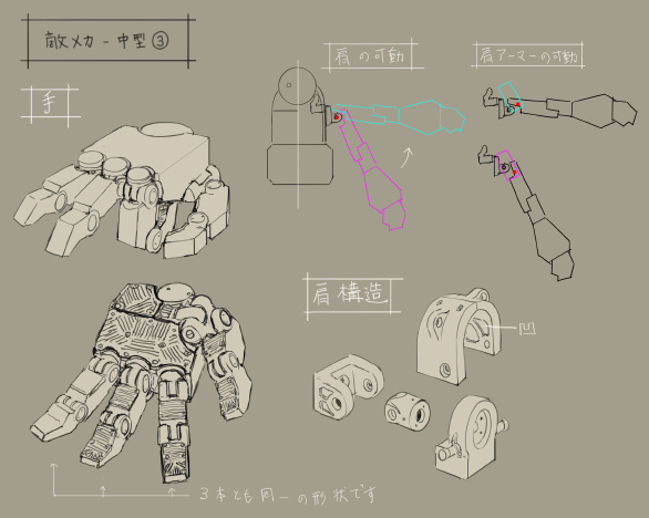
For parts that need to move in several directions, like shoulders and necks, most mecha designs use ball joints:
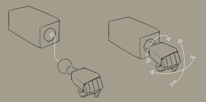
But I didn’t use ball joints for the Machines in NieR:Automata. Instead, I gave them several single-axis joints, working as a set, when I needed movement along more than one axis. A lot of real-world robots and heavy machinery are built like this, so it really emphasizes their mechanical nature.
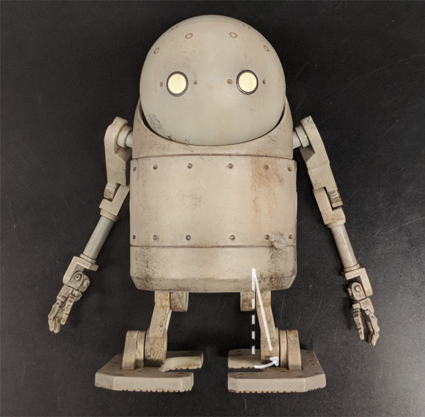
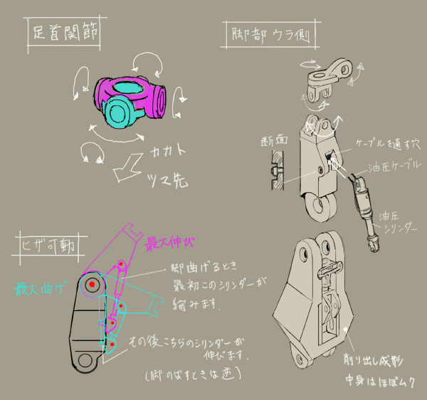 The upper left shows a system of combined joints for the Machines’ ankles.
Unfortunately, systems of single-axis joints like this are very hard to animate. Our animators never let me hear the end of it! Even though I cut them a break by using single joints instead of double joints… I guess we broke even.
Simple and elegant surfaces
Earlier on, I mentioned how YOKO-san stumped me by telling me not to use any parts that bent along three axes. I thought long and hard about all the mecha and industrial designs I’d seen in my life, and came up with two main ideas for how to work around that constraint.
1. Offset bends
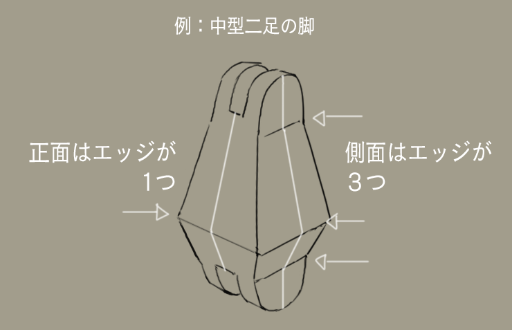 The surface you see from the front only bends in one place – but on the side, it has three bent edges!
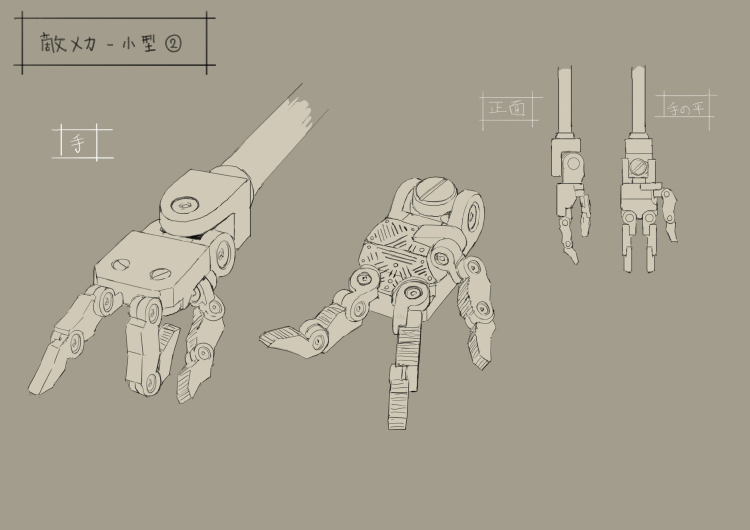
This is part of a mid-sized Machine’s leg. You can see the front face has one edge where it bends, while the side face has three edges. The shape of the part changes depending on which side you’re looking at. Tricks like this allowed me to create solid shapes that look relatively complex, while still appearing simple at a glance.
2. (Slightly) human contours
Even in the world of mecha, sticking to sharp angles and flat surfaces is a surefire way to end up with a boring design. I tried several combinations of flat and curved surfaces, set at all sorts of angles, as I assembled the Machine Lifeforms.
Curves add visual rhythm to a character’s silhouette, and I tried to think of the overall body lines of humans and other living things as I worked. The result? Shapes that look subtly “relaxed” from a physical standpoint.
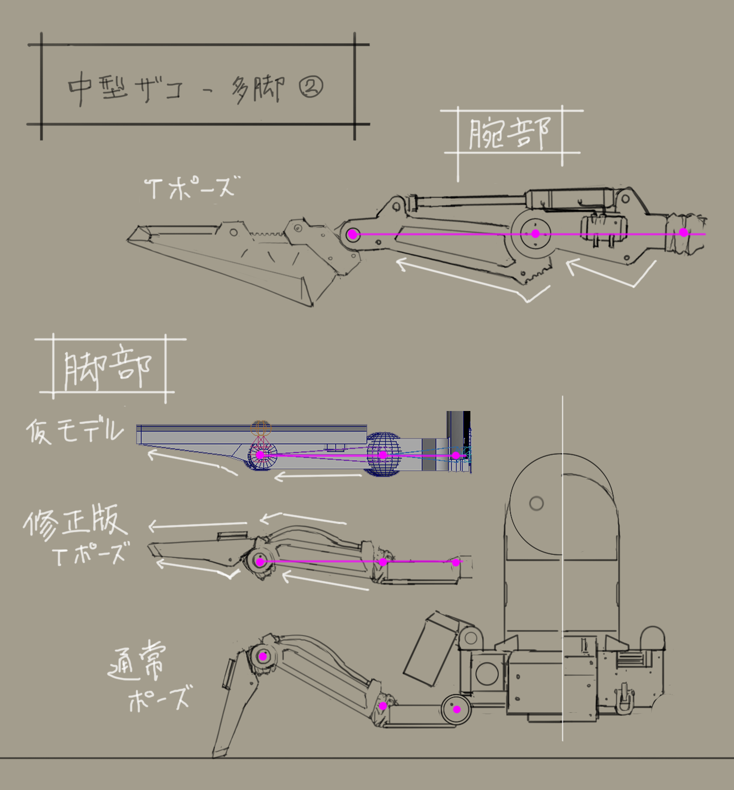 Multi-limbed Machine arm and leg designs. The top of this illustration shows an arm, stretched out in a straightened position we call a “T-pose.” In the center you can see a trial model for one of its legs. Below that, the final design for the leg in a T-pose. At the very bottom you can see the leg posed as it appears in-game.
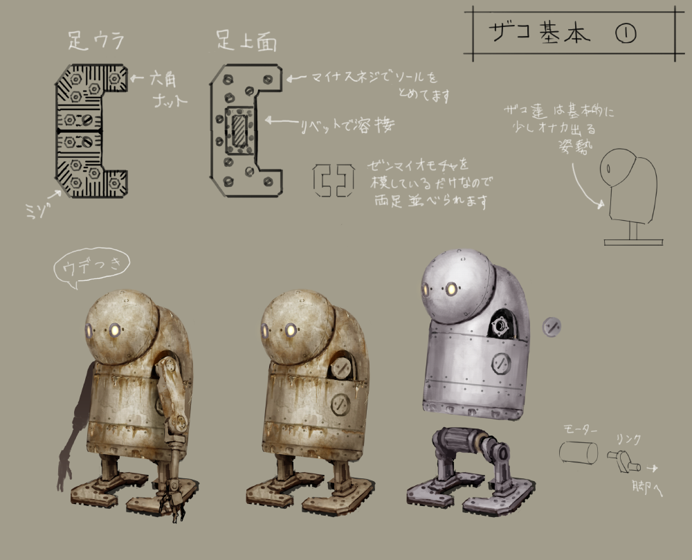
Non-slip surfaces on feet and hands
This is something that goes largely unnoticed, but I still put a lot of thought into it. The bottoms of the Machines’ feet and the palms of their hands have multi-directional grooves carved into them, to help them keep a firm grip on both the ground and anything they pick up. Look at the bottoms of your shoes; they’ve probably got grooves running in several different directions on them. Same reason!
I feel like this effort particularly paid off for the small, short-legged Machine Lifeforms, since the bottoms of their large feet are very visible when they get knocked over. I was relieved to see that my hard work on such a minor detail didn’t go to waste.
Thoughts on Specific Enemy Designs
Small Flying Machines
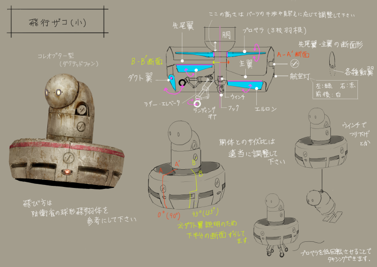
I used real-world airplane parts and aerial robots as a reference when I was designing the flying Machine Lifeform enemies. I wanted to make sure that what I created looked like it could actually fly.
These enemies bob and float around in the air like a jellyfish. It’s kind of cute. I was pretty pleased with myself when I saw this design bobbing through the game so organically.
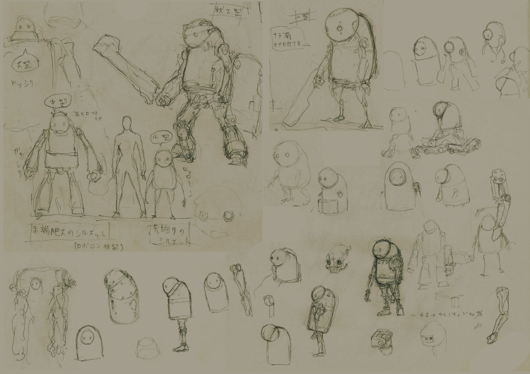
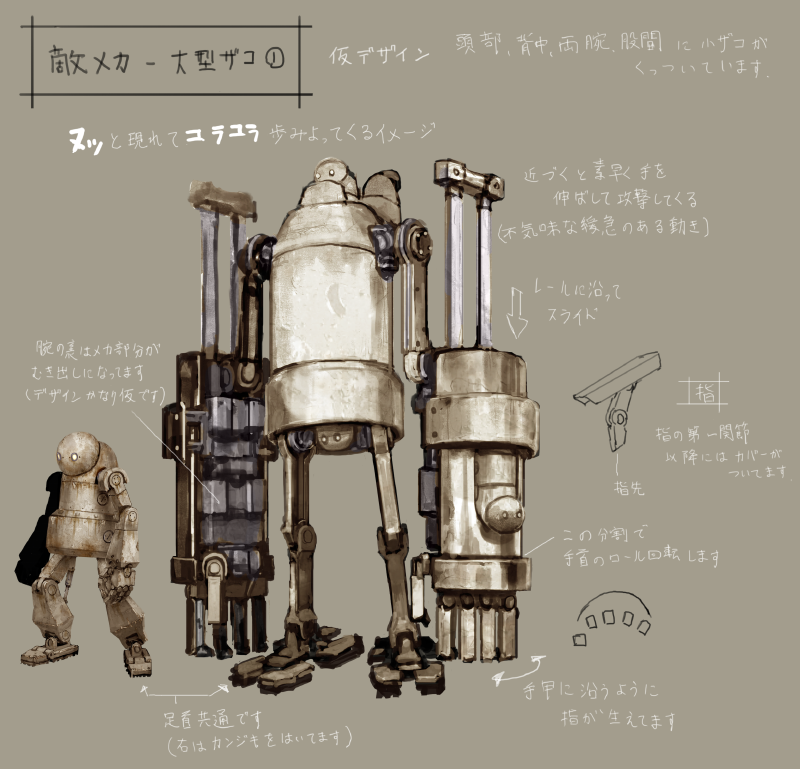
Large Bipedal Machines
These enemies are powerful, so I originally gave them a gorilla-like silhouette. But then, I thought, their attacks would have to look rough and barbaric to match, which gave me the nagging suspicion that they wouldn’t fit in with the decadent atmosphere of the game.
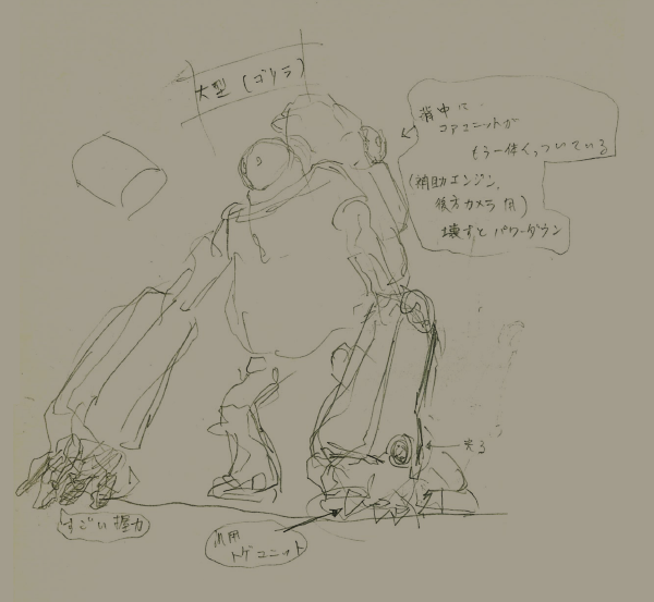
So I scrapped the “gorilla” idea and thought up a new design. This time around, I imagined them swaying uneasily as they carry their own massive frames.
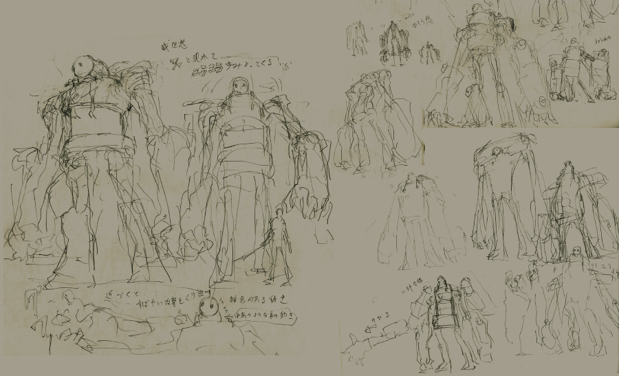
 This giant Machine Lifeform looms over the player characters and sways as it slowly walks towards them. When it gets close, it extends its hands in a flash to attack. The sudden change in movement speed is discomforting.
The final design went on to become one of the most recognizable Machine Lifeforms. One of them even appears in the art we used when we announced the game.
Engels
Not only is Engels the first boss you fight in the game, he was also one of the very first Machine Lifeforms that we created. My early sketches of Engels look very crude, but even in the earliest stages, we already decided he’d be a giant made of trusses. We knew how he’d be put together and what sort of attacks he’d have. He was nearly finished very early on in production! All I had to do later was adjust his shape and details to make him look like he’s made up of several different heavy machines combined together – a concept that came up farther along in development.
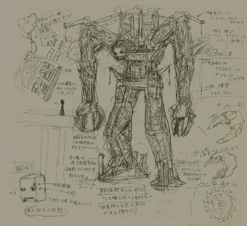
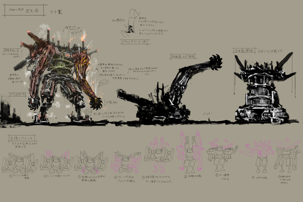
I shared my sketches with YOKO-san and the team as I worked, and the “combination” concept came out of those discussions. I’m personally fond of gimmicks like this, so I had a lot of fun coming up with different ways to put Engels together.
I really like how he uses cranes to lift up his own arms – he’s construction equipment, and what he’s building is himself.
Simone
Three people worked together to design this distinctive boss character. Yoshikaze Matsushita drew up the original idea, Yuuki Suda worked out the rough design, and yours truly added in the final details.
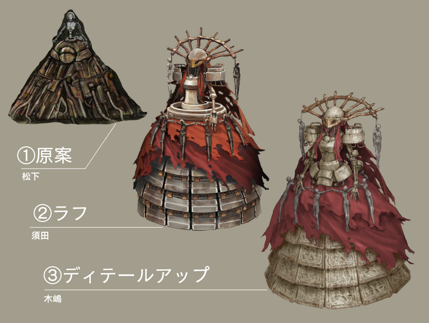 From left to right: Yoshikaze Matsushita’s original concept, Yuuki Suda’s rough design and my detailed final design.
As you can see, Simone’s concept was mostly complete at the rough design stage (in the middle up there). I made some adjustments to match her lines and level of detail to the other Machine Lifeforms. I revised her design with an eye towards how she’d be assembled as an in-game 3D model.
Remember how YOKO-san told me not to use shapes that curved along three axes? That meant I had to use combinations of parts, and their positions in relation to each other, rather than individual parts themselves to convey Simone’s femininity.
Closing Remarks
I always enjoy reading designers’ commentary on their own work, as well as writing my own, so I’m afraid this devblog might have run a little long. Thanks for reading all the way to the end! I sure hope you enjoyed it.
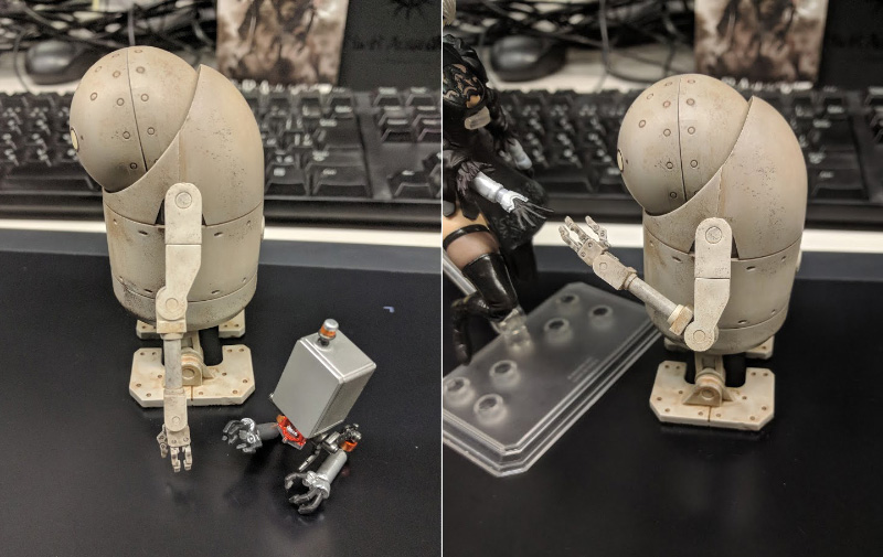
It’s very satisfying to sit here, holding this new Machine Lifeform figure in my hand. I put a lot of myself into this design, and here it is, in the real world! Maybe you have one of your own? If so, please go back and reread this blog again while you play with it! Maybe it’ll give you a new level of enjoyment.
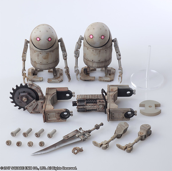
NieR:Automata BRING ARTS 2B & Machine Lifeform set
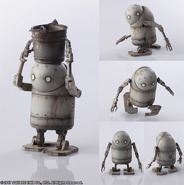
Another set in the series should be hitting the Square Enix shop before long. This one contains two Machine Lifeforms, for the person in your life who just can’t get enough of the little guys. (Sorry for the shameless plug – I promise nobody put me up to this!)
NieR:Automata BRING ARTS Machine Lifeform set
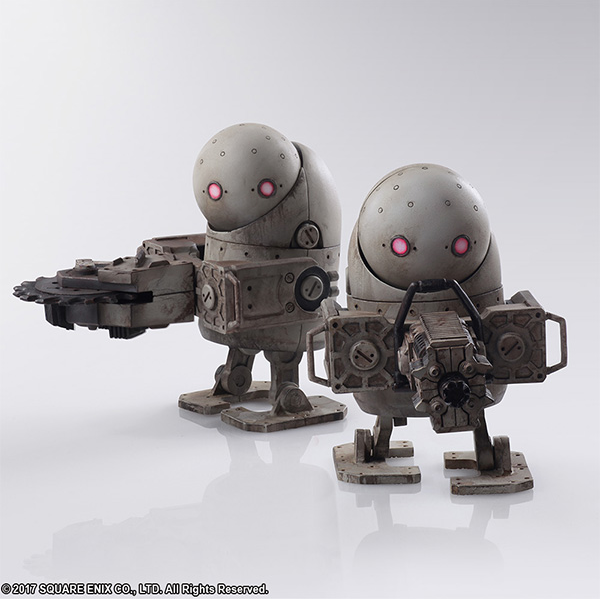
I’ve got my fingers crossed that a flying Machine Lifeform figure won’t be far behind! (Nobody’s said anything to me about making one, but I can dream…)
 Hisayoshi Kijima
Hisayoshi Kijima joined PlatinumGames in 2011.
He designed the UI for Bayonetta 2, Metal Gear Rising: Revengeance, The Legend of Korra, and TRANSFORMERS: Devastation – but he also has a passion for mechs! He loves them so much that he majored in mechanical engineering in college. This uncommon background as an artist served him particularly well as he designed both the UI and the mechanical characters for NieR:Automata.
Don’t miss his earlier devblog about designing the NieR:Automata UI!