Hello. I’m Hisayoshi Kijima, the UI and mecha designer for NieR:Automata. While this isn’t my first devblog, it’s the first I’ve written since Bayonetta 2. Game UI – that’s short for “user interface” – often goes largely unnoticed, so I was glad to hear that some fans saw some of our other NieR:Automata devblogs and asked for one about my work, too!
NieR:Automata director YOKO TARO can be quite particular about what goes into his games, and UI is no exception. I’d like to introduce my UI work on NieR:Automata’s UI, and give you a look at the sort of direction YOKO-san gave as well.
What a UI Artist Does
Modern games are filled with health gauges, dialogue windows, and all kinds of menu screens and pop-ups that convey essential information. UI artists like me make all of these.
When I design a user interface, my process goes something like this:
- Come up with a visual concept design for the UI
- Make several designs for menu screens and on-screen elements, meeting specifications from the director and game designers
- Prepare data for these UI elements and hand it off to programmers so they can put it in the game
- Try out the UI in-game, looking for any adjustments or polishes that need to be made; repeat until you’ve got a finished, high-quality UI!
For this blog, I’d mostly like to focus on 1 and 2 – concept and menu screen design.
Balancing Science Fiction and Fantasy
The world of NieR:Automata leans heavily towards science fiction, but the previous title in the series (NIER Replicant/Gestalt) had more of a fantasy aesthetic. When I put together NieR:Automata’s UI concept, I tried to make its sci-fi elements seem like a natural extension of the first title’s fantasy.
I had several visual notions to work with: The previous game’s UI; conventional sci-fi aesthetics; 2B herself; and the general idea of a luxurious and decadent world. Mixing all of those aesthetics together, I arrived at my key concept for NieR:Automata’s UI: a design that was systematic and sterile, but also beautiful. At that time, I felt strongly that the best way to convey this would be to avoid ornate decoration and focus on giving it a clean, graceful and flat design. But I soon realized that if I stuck too close to that idea, the final design would end up flavorless.
I decided to add to the “systematic and clean” part of the concept by slipping in a subtle “musical score” motif. This also helped strengthen the “fantasy” vibe of the design.
Now, when I say I added a “musical score” motif, I don’t mean to say I put in the flowing lines of a treble clef. Instead, I too inspiration from forms like staff lines, bass clefs, and the double-bar lines that conclude pieces of music. Rather than including musical elements directly, the idea was to suggest them through symbolism. (This is also echoed nicely in the colons in the game’s title and Pod dialogue – another symbol that also shows up often in musical scores.)
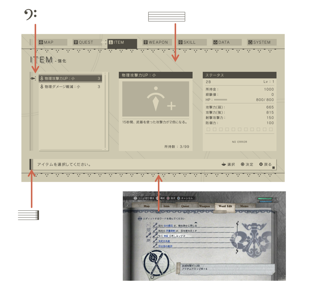
The decorations at the top and bottom of the menu screen were based on similar borders from the first NIER’s menus. Elements like this add a decidedly “analog” feel to the “digital” design. By incorporating them, I could control the balance between fantasy and science fiction as I put together the concept for the UI.
From Flatness to Form
The base of this concept is, for the most part, a flat design. To make it fit in the game’s setting a bit more, I added a faint grid texture, and put some distortion and limb darkening around the edges. This makes the menu look like it’s being displayed on a monitor with a convex screen. Thus we arrive at the final design:
 This GIF shows the design looks before and after adding the screen/lens effects.
And with this little skeuomorphic* touch, we’ve taken our simple, flat design and built it up into something that feels more physical and real, don’t you agree?
*What’s a skeuomorph? It’s something new, using design elements from an older version of itself. Like a “Save as…” icon with a floppy disk on it in 2017.
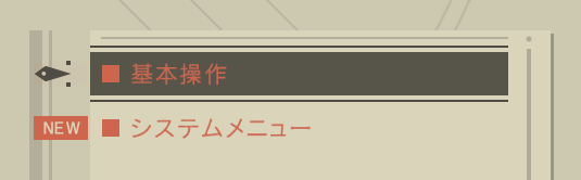
I also did some fine adjustments to make our UI animations look nice and fluid on the flat screens people will play the game on – they should look a little “moist,” not dried-out and flavorless. This fluidity is pretty subtle, but I’m particularly fond of how things flow when you pull up the system menu:
Building on Beige
The very first specification for the UI that I got from YOKO TARO was to “make it a nice, warm beige.”
It was much easier said than done. At first, I couldn’t even imagine how I’d reconcile a “warm beige” with a cold, clean digital aesthetic!
I figured I’d start with something I could picture more easily – a stark, high-contrast black and white design – and gradually nudged it towards a softer beige. Eventually I landed on the color that felt right. It took a lot of hard work to find and maintain a readable color scheme among all the soft, low-contrast beiges.
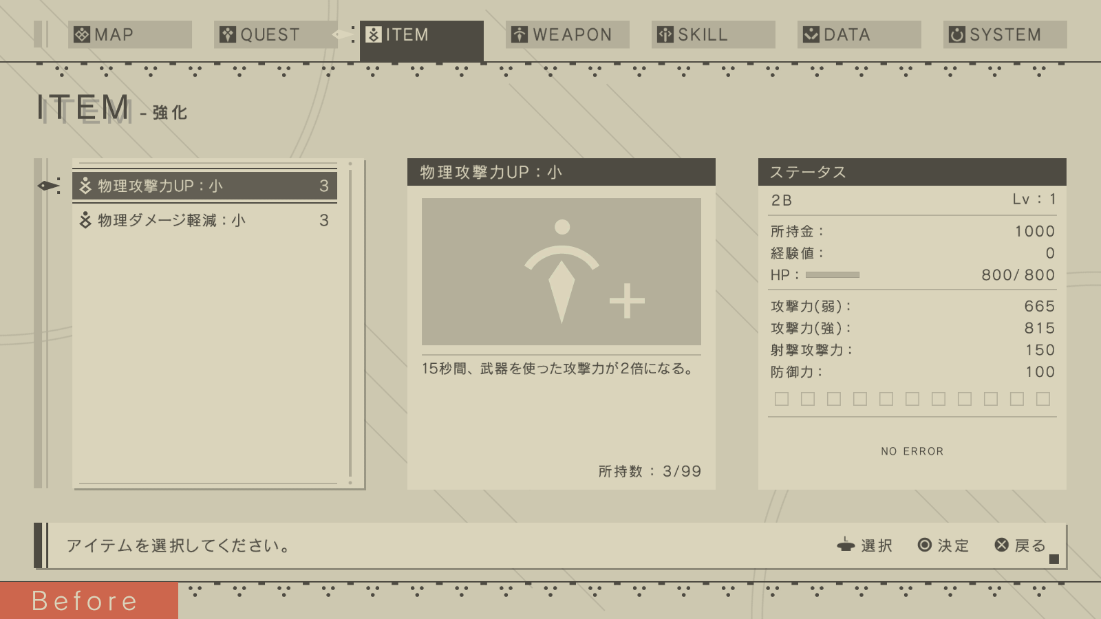
 My original color scheme had much higher contrast than the final design.
 The finished color scheme.
YOKO-san also said he wanted to avoid using a wide range of colors, so I had to design the UI to depend on its colors as little as possible while still effectively conveying information.
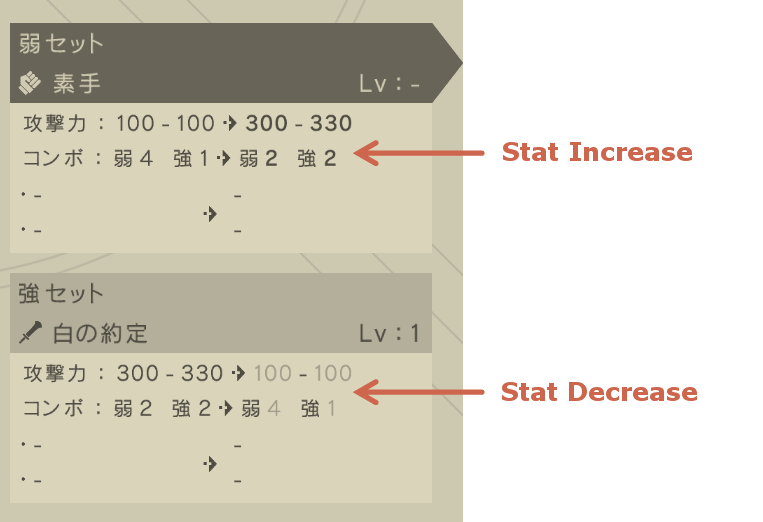
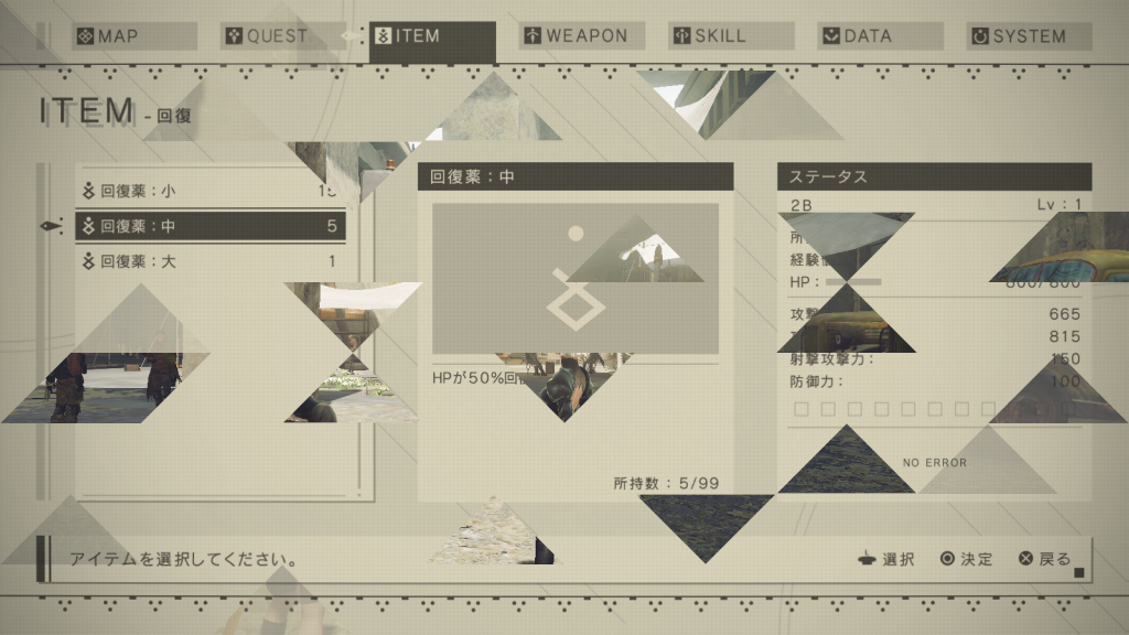
That meant, for example, changing the thickness and darkness of font colors to show changes in stats:
When I had to use colors to make sure things were readable, I limited myself to a drab red-orange. (Okay, there are some rare instances of white and pale green, too.)
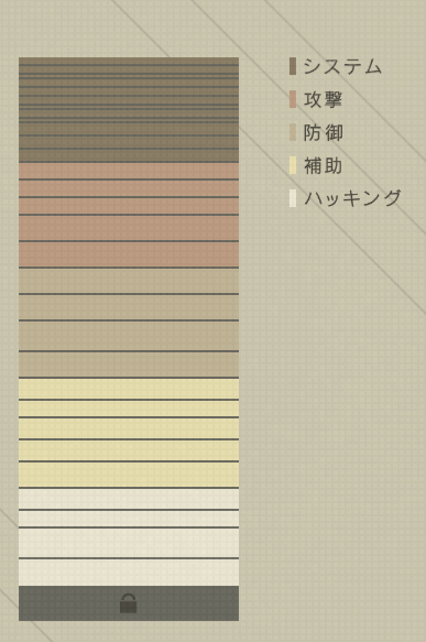
The plugin chip menu posed a challenge, since I needed to clearly color-code the different types of chips. Through sheer trial and error, I found a readable set of colors that were distinct enough to tell apart, while staying consistent with the design.
The UI color scheme is also reflected in the hacking minigame and the 3D models in the world map screen. This helps give the game a unified visual identity.
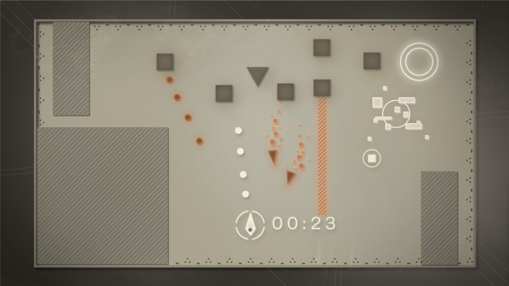 Concept design for the hacking minigame.
 The 3D models that make up the world map screen.
Accessible Functionality
Throughout my time working on NieR:Automata, YOKO-san gave me one specific order so many times that it’s stuck in my memory. “I want the menu controls so simple that someone who doesn’t usually play major games can use them,” he would say. “I want your grandmother to be able to be able to use them.”
The menu had a couple fundamental rules:
- All menu functions must be accessible through the joystick and O/X buttons alone.
- On-screen control guidance should be very limited – generally just explaining the above three controls.
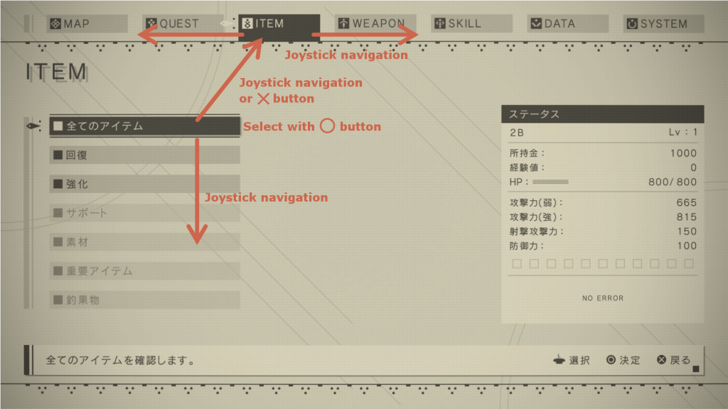
It’s very common for game menus to make use of shoulder buttons like L1 and R1, and other face buttons as well. I’ll admit I started off bashing my head against the wall, trying to handle switching between category screens and other navigation without them. At times it felt like the demand for simple controls was irreconcilably at odds with complex menu specifications, resulting in some trial controls that were pretty hard to grasp. YOKO-san and I often foug- err, negotiated over the menus at length, trying to end up where we both wanted to go.
In the end, we accepted that people who’re already used to playing games with a lot of menus are subconsciously a bit more comfortable when they have more than just the stick and O/X buttons to work with. So they aren’t necessary to navigate through the menu, and the onscreen help doesn’t say anything about them, but there are some hidden shortcuts that use L1, R1 and the Triangle/Square buttons. (Did you notice them?)
These shortcuts include:
You can move between system menu category screens, and page through weapon and unit data, with the L1 and R1 buttons.
From the Unit Data list, you can change units’ equipment and control animation playback with the Triangle and Square buttons. You can also rotate the model with the Right stick.
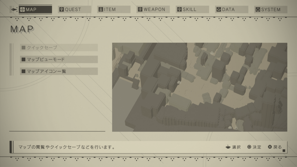
On the Map screen, you can use the Right stick and L2/R2 to quickly transition to the fullscreen map.
No matter where you are in the system menu hierarchy, you can usually press the Options button to go right back to the game. You can also press any button to skip the menu-closing animation.
In our first meeting about NieR:Automata’s UI, YOKO-san said he wanted to “add something strange. There’s already lots of games with normal UIs. I want to make a weird one.” But throughout development, specifications got more and more realistic and serious, and it became difficult to do anything truly off-the-wall.
But there will always be a few wildcards on any devteam – say, a game designer with a screw loose who offers up oddball ideas, or a programmer who adds some wonky feature for their own pleasure. They do usually catch a stern talking-to from the bosses, but thanks to these wildcards, we ended up with a UI that managed to meet YOKO-san’s weirdness quota. Let’s hear it for the weirdos.
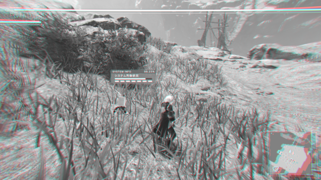
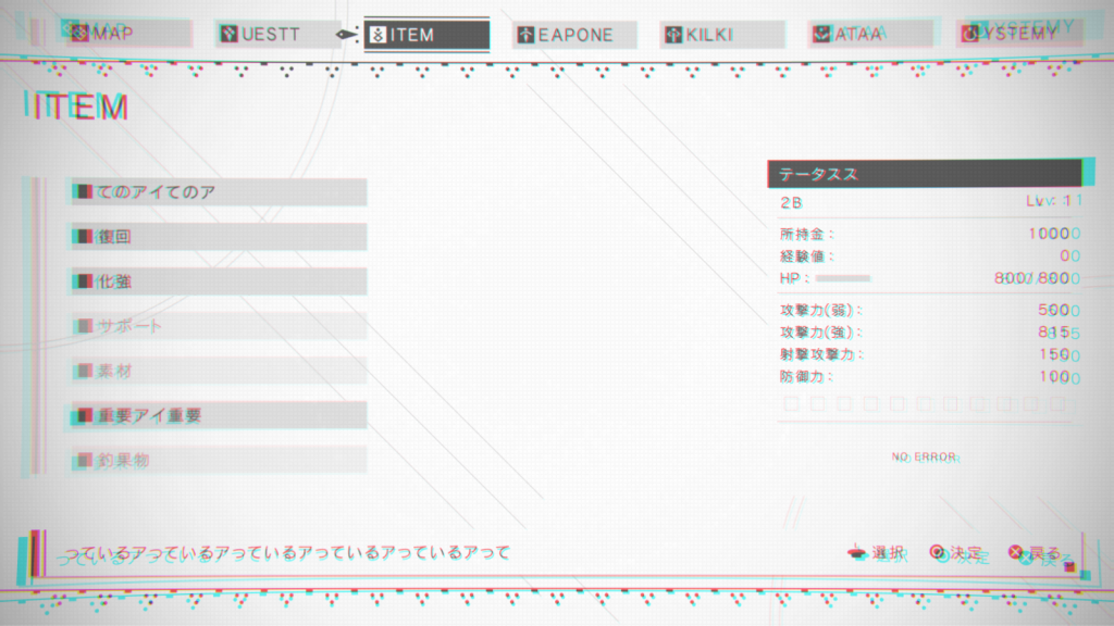 Use your self-destruct function to see this “broken” UI.
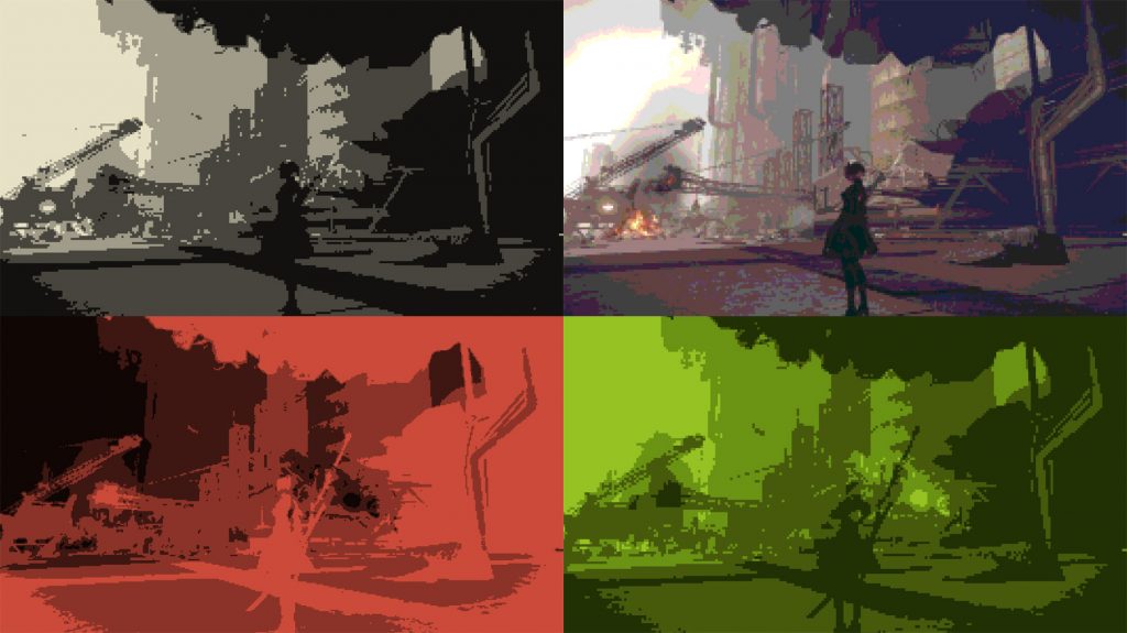 Various “nostalgia filters” inspired by games of yesteryear.
I’m quite pleased with how NieR:Automata’s UI turned out myself, but what I’m really pleased with is how positive the response has been from players. Looking back on it now, I’m also surprised anew at how outlandish some of YOKO-san’s directions were! I ended up writing a good bit more than I expected – thanks for sticking with me to the end!
Oh, by the way, I didn’t just design NieR:Automata’s UI. I also did all the mecha designs, too. But you wouldn’t be interested in reading more from me about that… Would you? I’ll warn you, that’ll probably get pretty long, too…
 Hisayoshi Kijima
Hisayoshi Kijima joined PlatinumGames in 2011.
He designed the UI for Bayonetta 2, Metal Gear Rising: Revengeance, The Legend of Korra, and TRANSFORMERS: Devastation – but he also has a passion for mechs! He loves them so much that he majored in mechanical engineering in college. This uncommon background as an artist served him particularly well as he designed both the UI and the mechanical characters for NieR:Automata.