Hello everyone, this is game director Abebe Tinari once again!
At this point many of you will have played the game…some of you may have already finished it! I expect you will know what I mean when I say there is a certain charm to the experience that can’t be conveyed via trailers alone. It has made me very happy to see many people commenting online that the game really clicked for them when they got a chance to control Cereza and Cheshire for themselves. If you’ve yet to give it a go, there is a playable demo currently available for free on the Nintendo eShop. Please go check it out!
For those of you that already have played, I think I can imagine one point you’ll mention about the game…It looks like a fairytale picture book!
Today I would like to talk about how we arrived at this visual motif.
After I joined the project and decided on the main gameplay concept for Bayonetta Origins, we were ready to start making a prototype. However, there was still a critical piece missing. We had a plot. We had a theme song. We had a gameplay hook. But we were missing something tying it all altogether. The answer arrived when Art Director Tomoko Nishii joined the team!
Nishii will explain the details in just a moment, but first allow me to talk about why I was instantly captivated by her idea to depict the entire game as if it took place within the pages of picture book.
Like many of you, I enjoyed looking at picture books when I was a kid. However, it wasn’t until I was an adult that I truly fell in love with the medium. After moving to Japan, I was struggling to find reading material to learn the language. Textbook sample sentences were mind-numbing, but any novel or comic I would be interested in was far too difficult to read with my limited vocabulary.
Picture books tell deep stories using simple language. Although their plots are often concise, they feature themes that touch on fundamental emotions and shared human experiences. Illustrations make everything easier to parse, and the addition of a visual dimension opens a whole new area of creative expression that sets your imagination in motion.
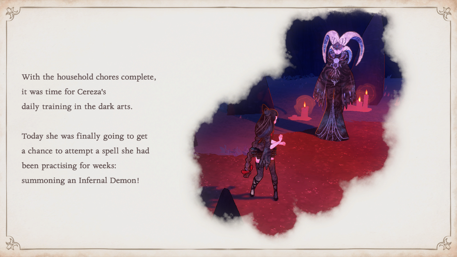
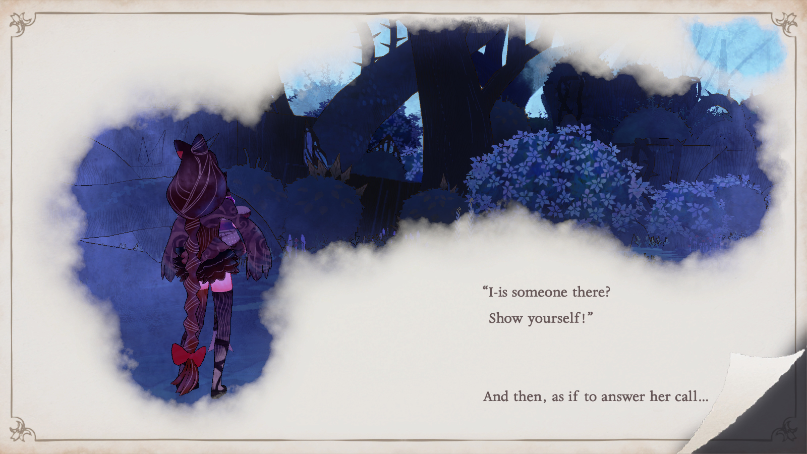
When Nishii suggested using a picture book as a visual motif for our game, all the pieces we had floating around clicked into place. The story this time is about Cereza’s journey into a forbidden forest—a classic fairy tale premise if I ever heard one! Because the story is focused on Cereza’s emotional growth, the presence of a narrator allows us to give the player a peek into what she is feeling, as well as a technique to vocalize the words of Cheshire the demon.
Demons in the world of Bayonetta usually speak a language called Enochian. Read more Cheshire’s lines here: Bayonetta Origins: Cereza and the Lost Demon Releases Story Trailer. Demo Available Now!
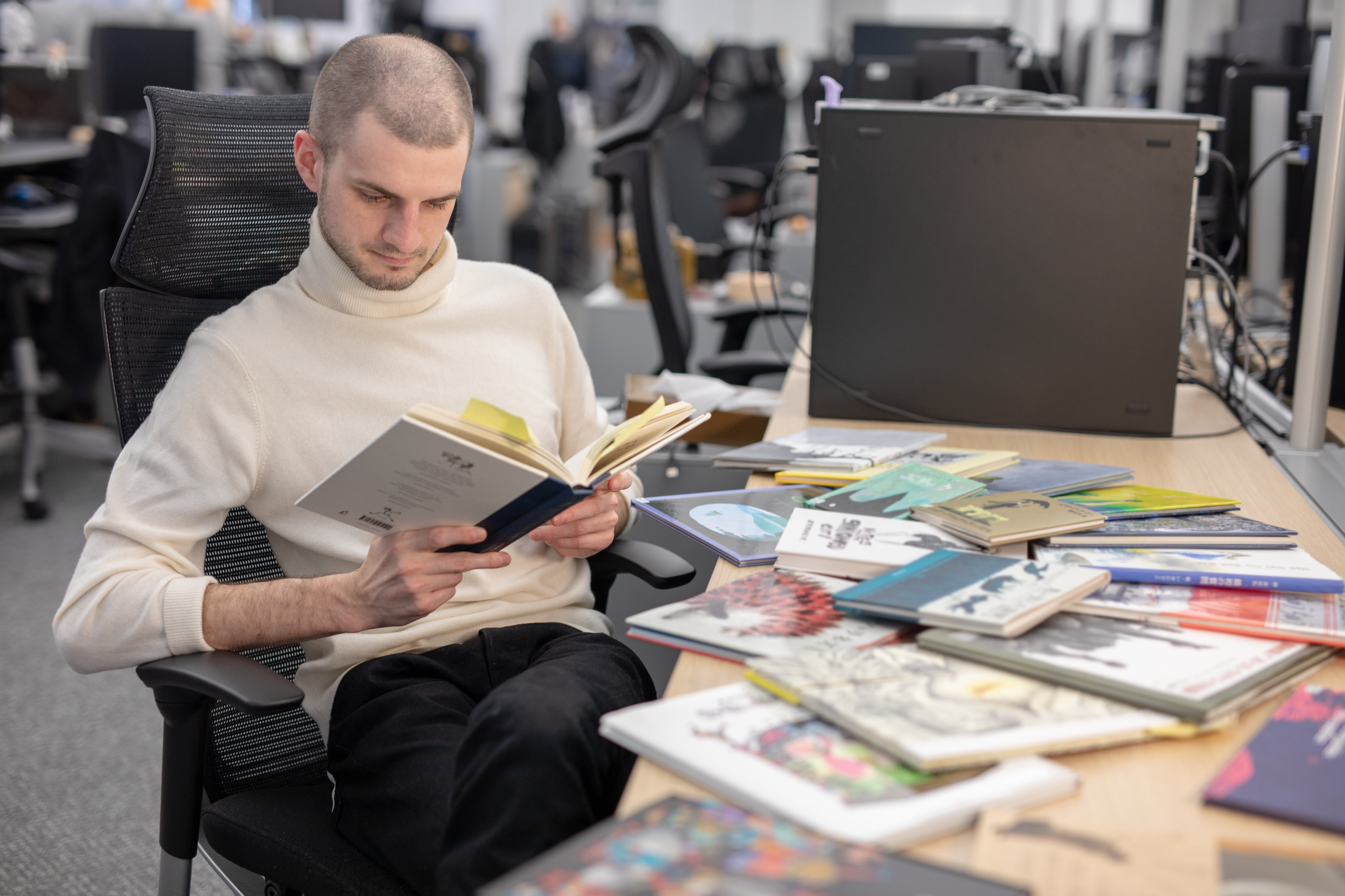
Some of the picture books we used as reference materials during development.
Don’t worry, we just arranged them like this to take this picture, we usually keep them on a shelf.
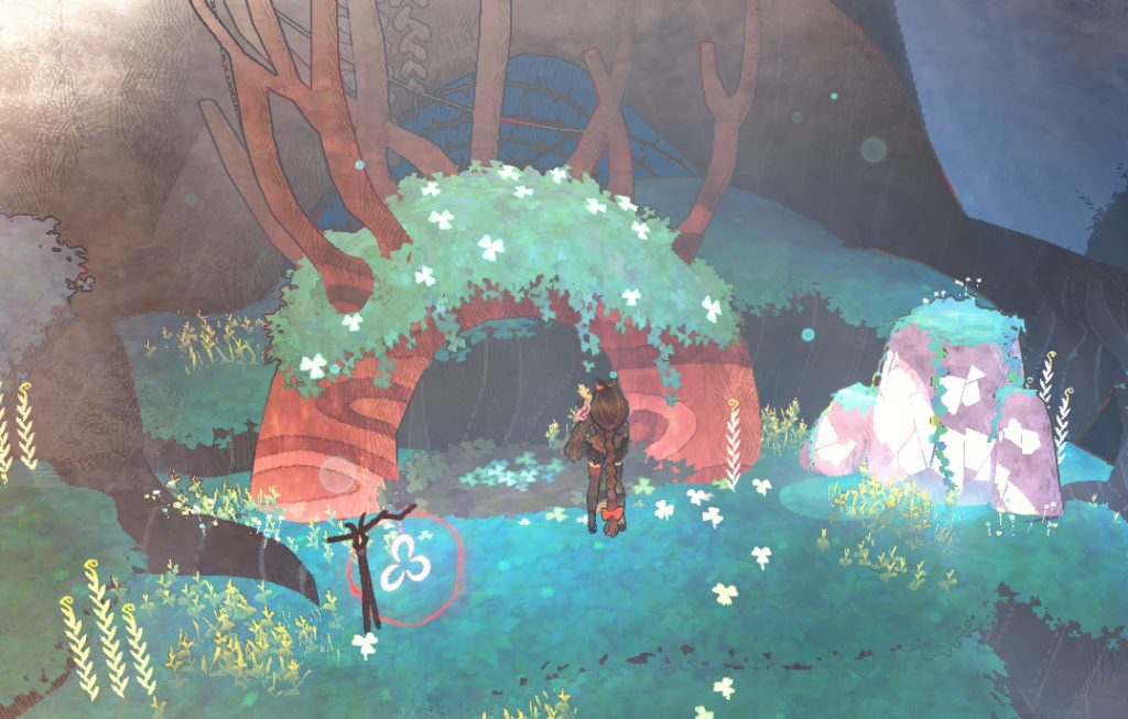
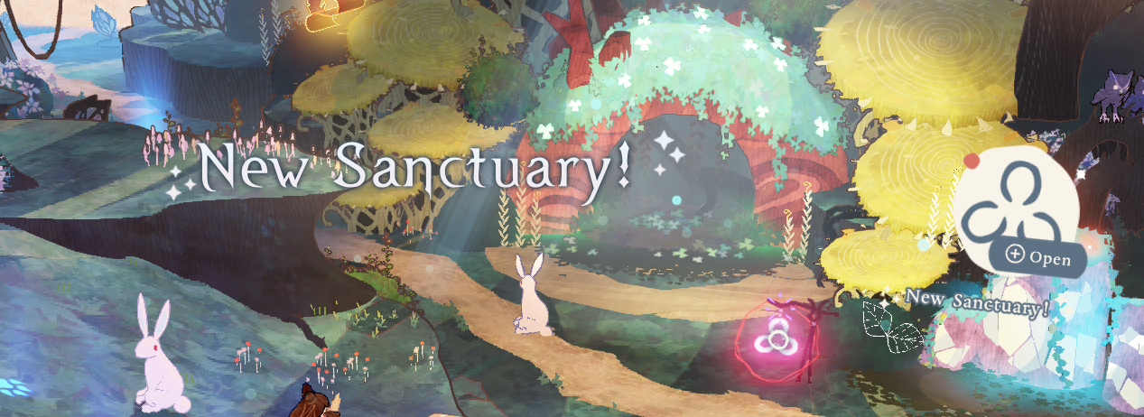
But the advantages of this motif were not limited to storytelling—they extend to all parts of the game. Since the player controls Cheshire with the right analog stick, we decided from the start that the camera would be fixed overhead. This perspective gives the player the feeling of peering down onto the “page”, and the effect of this page being colored-in as you explore the forest makes the world feel dynamic, even without sweeping cinematic camera movement.
As development progressed, more and more talented artists joined the team. United by the central motif, each added to the picture book world in their own way. The concept art came to life with 3D models and animations. Avalon Forest is drawn in before your eyes, ready to explore. When you launch the game, you are greeted by a lavishly rendered book as the title screen. Even the menus and map seem like they would right at home in a classic picture book!
Also (and this should not be understated) …it just looks really dang pretty.
Now, let’s hear from Nishii herself about what went into making this idea a reality.
Art Director Tomoko Nishii
Hi everyone. My name is Tomoko Nishii and I am the Art Director of Bayonetta Origins: Cereza and the Lost Demon. My role in the game development effort was to oversee the entire area related to the look and feel of the game, as well as to come up with the character designs. Since this is my first art-related article, I’d like to talk about the concept and the direction of the art in the game in a broader sense.
The overall concept for the game’s artwork is that of a “picture book” style. As to why I went for that, well I was honestly just going with my gut feeling. For one thing there was that desire to see something in this spin-off that couldn’t be done in the mainline Bayonetta games. I also felt that the whole picture book art style went hand-in-hand with the story and the themes communicated in the game, and I also believed that a more realistic approach just would not be enough to depict the charms emanating from Cereza and Cheshire. I can keep going on, but I knew right from the moment I found out about the game’s concept that it needed to be in a picture book-style. I was so convinced by the concept that I just went and proposed my idea without much of a second thought. And it really resonated with the director… or at least I really hope it did. Once everything was decided, we first started working on the design of the main character, Cereza.
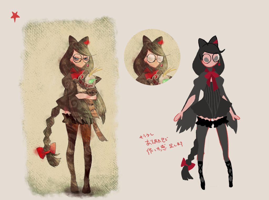
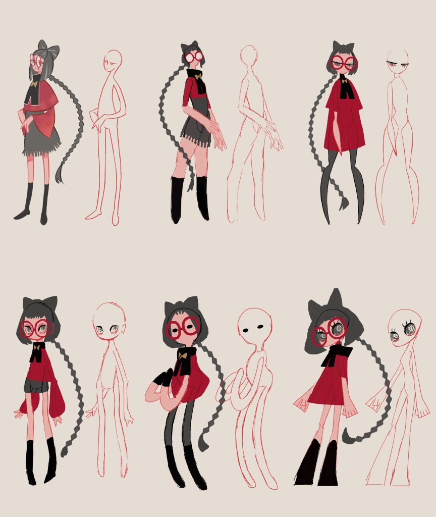
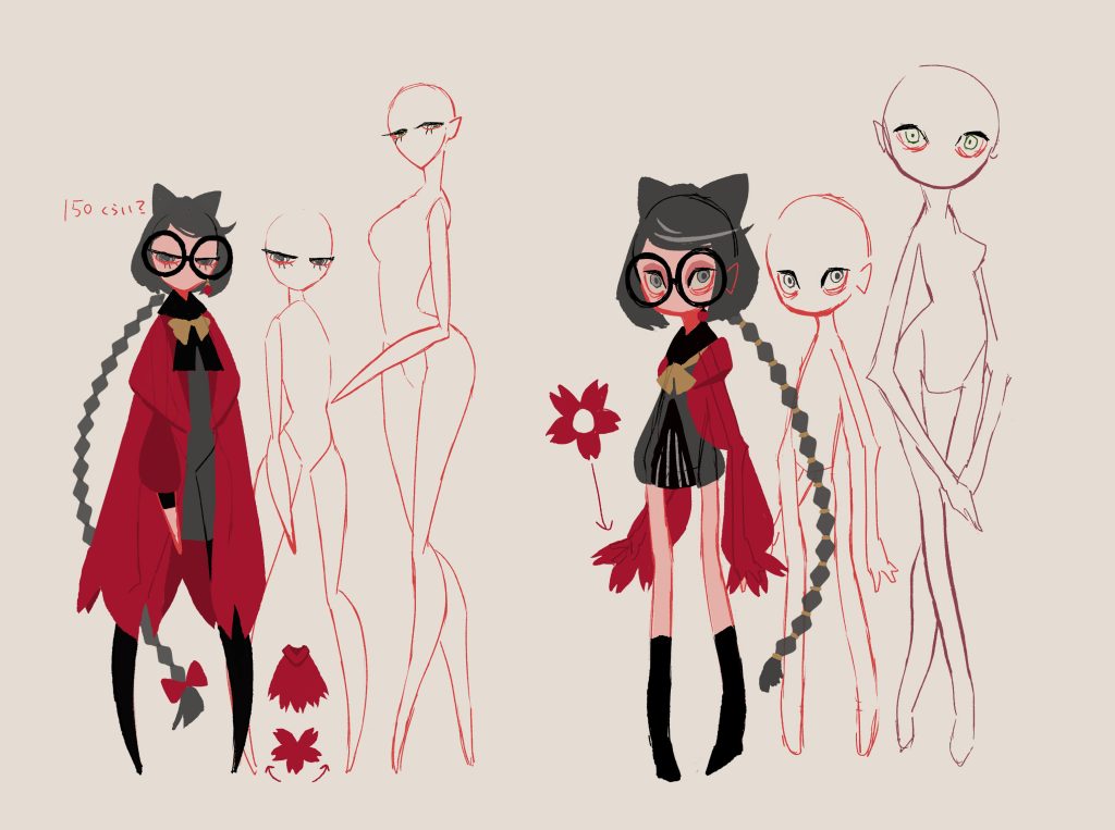
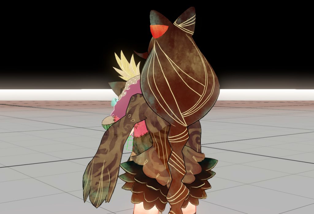
When you think of the character Bayonetta, you probably think of style and panache! That said, this story is centered around a “young” Cereza, so I wanted to express her character in a much cuter and more innocent way, but still being memorable. I kept all these in mind as we went ahead with the designs.
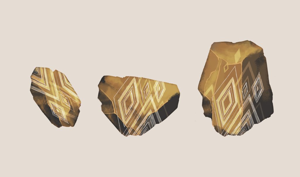
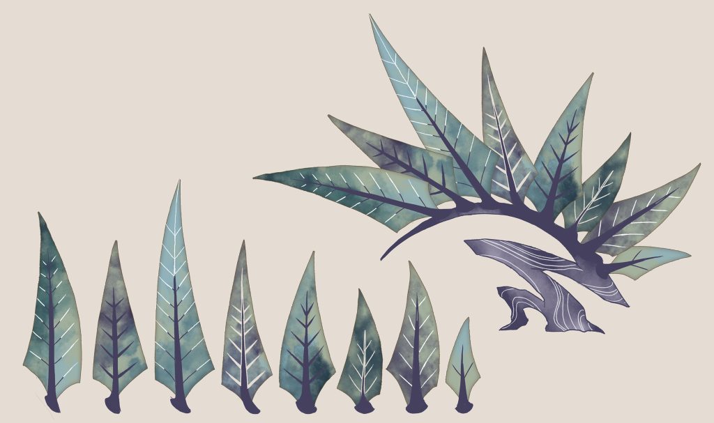
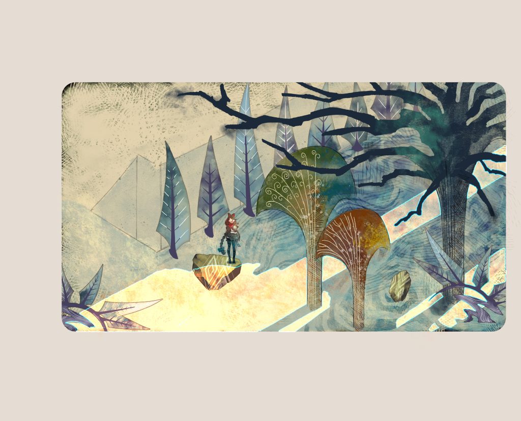
So, with the concept of this world decided, we really wanted to bring all the elements in the background to life as well. Even a mere bush or a mere stone, everything needed to have that particularly cute and vibrant feel to it. It is no exaggeration to say that all the elements were assembled around Cereza’s character.
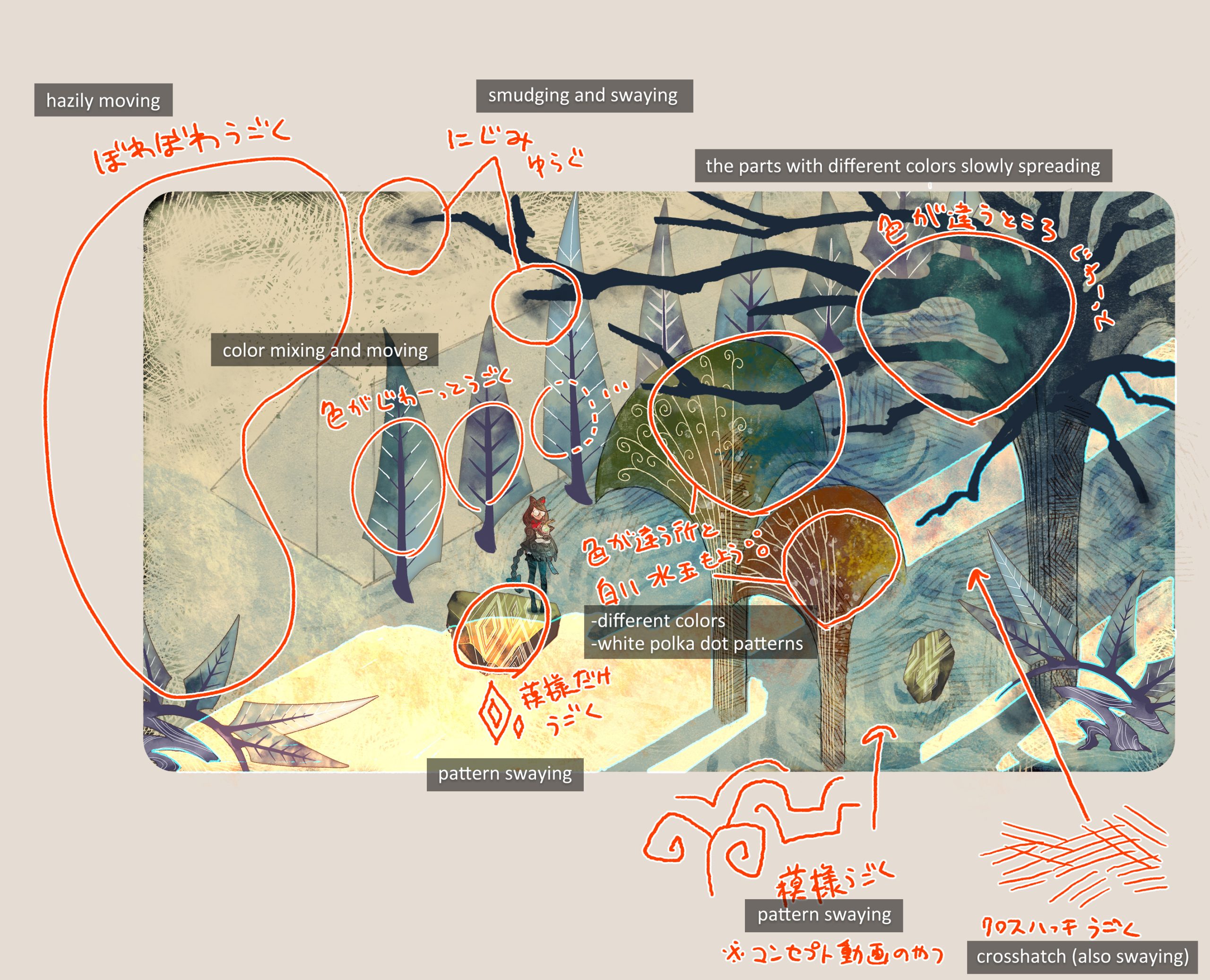
Rather than just focusing in on the tiny details of each individual tree or stone, I went and expanded my vision a little bit further out. The supplementary notes are full of onomatopoeic gobbledygook (at least in Japanese) , but all that matters is my idea gets across…if it gets across…
From this point on, I asked the artists to create the backgrounds and concept art and then put everything together across the screen.
After we determined the picture book concept, we decided rather early on that the elements of the story would be “completed” within the pages of the book itself. This picture book concept was difficult to narrow down as different members of staff all had their own ideas on what a picture book should look like. There are many games out there that claim to be picture book-like, but they tend to be more reminiscent of lift-the-flap books or even paper-puppet theater. In other words, having elements “outside” the world of the picture book.
At first, a lot of the suggestions from the team included elements like those, but I knew that we didn’t need to use those kinds of gimmicks that had been used before elsewhere. I made it clear that we wanted the game to feel as it were pulled directly from the pages of a picture book. With a few exceptions for playability and artistic expression, this decision seemed to set the tone for the supervision of visuals, including not only character models and backgrounds, but also the cutscene events and UI effects.
So that’s how we ended up with a final product with this concept, but I can’t pretend to talk about it as if it were my own achievement… so I will ask each team member to write about the game in more detail in the future. However, I would like to introduce some of the elements that may have come about because of the discussions mentioned above, just to give you a rough idea.
 A shader which gives the impression of painting on a flat surface without creating a three-dimensional effect.
 A perspective expression that conveys line drawing and painting instead of depth of field/air perspective.
 A screen layout where the text is not bound to a fixed location.
 A HUD that looks hand-drawn but not quite graffiti-like.
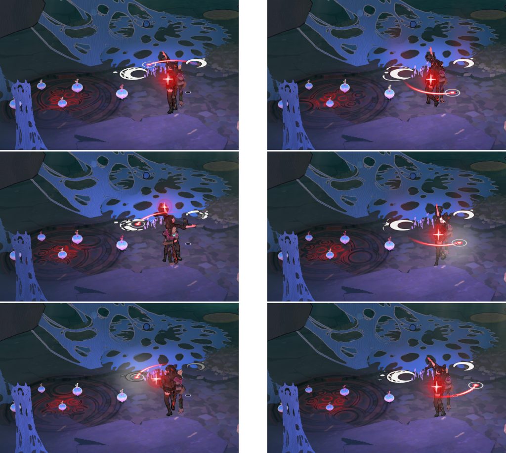 Hand-drawn animation effects.
Speaking of effects, there were quite a few veterans on the team, and I remember constantly griping away at everyone. “Too much bling!”, “We don’t need 3D!”, “No lens flare! That’s for cameras!”, etc. Other than that, I’m pretty sure I said “No, this isn’t the picture book we’re going for.” so often that everybody got sick of it. I don’t doubt the team was annoyed by me butting in their specialties.
Nevertheless, I believe that the result is a consistent visual look and feel throughout the entire experience. What do you think?
I assume that you are somewhat interested in this game if you’re reading this article. Everyone has their own reasons to pick up the game, but I truly hope the visuals will be a reason for you to try it, as we have drawn a lot of amazing pages in this unique story book experience! Bayonetta Origins: Cereza and the Lost Demon awaits!
 |
Abebe Tinari Originally from Vancouver, Canada, Abebe Tinari moved to Japan in 2009 before joining PlatinumGames as a translator in 2013. After taking part in the localization of Bayonetta 2 , he moved to game design. Since then, he has worked on Star Fox: Guard as well as numerous other titles before making his directorial debut with Bayonetta Origins: Cereza and the Lost Demon. |
 |
Tomoko Nishii Joined PlatinumGames in 2011. She worked as an Environment Artist for The Wonderful 101 before taking part in a number of titles as a concept artist. She provided some of the picture book illustrations for NieR:Automata. As Art Director, Nishii handled the character designs for Bayonetta Origins: Cereza and the Lost Demon and oversaw all the visuals. |