Hi everyone! My name is Tomoyuki Kondo, and I was the Lead UI Artist on Bayonetta Origins: Cereza and the Lost Demon. In this entry, let me share some insight and behind-the-scenes info for the design concept of the UI that so beautifully decorates this unique experience!
Talking more about “UI”
UI (User Interface) refers to the interface components displayed on the game screen. These components include bars/gauges (health, magic, etc.), icons, item numbers/displays, objectives, and menu screens. UI Artists are mainly responsible for designing and implementing these UI components in an easy-to-understand manner and in a style that best suits the game.
Until a few years ago, the field of UI was a somewhat underestimated element in game development. Developers these days are more invested in producing advanced UI, and this direction is something we have continually focused on in our past games as well. If you are interested in the field of UI, feel free to check out the UI-related entries for other games.
———————————-
Astral Chain:
https://www.platinumgames.com/official-blog/article/10397
NieR: Automata:
https://www.platinumgames.com/official-blog/article/9624
Bayonetta 2:
https://www.platinumgames.com/official-blog/article/6733
Anarchy Reigns:
https://www.platinumgames.com/official-blog/article/9922
Bayonetta:
https://www.platinumgames.com/official-blog/article/2026
———————————-
Here, I’d like to introduce you to what our objectives were behind designing the UI for Bayonetta Origins: Cereza and the Lost Demon, which definitely has some of the most distinctive visuals out of any of the games we developed.
How we went about making UI design decisions
Firstly, I would like to talk about how we went about deciding the overall UI design for the game. I joined this project about one year before its completion. During this one year, I only had about six months to work freely on the UI. By the time I had joined the project, the concept of the picture book-like UI had already been defined. This meant that the rough direction, elements of each screen, theme colors, and characteristic expressions such as page-turning and freehand-style animation had already been verified and set in place. However, during the game’s long development period, the design was repeatedly extended and remodeled, resulting in variations in each screen and unclear design points. Therefore, after consulting with the game’s director Abebe Tinari and art director Tomoko Nishii, we re-established common design rules while keeping the relevant elements as they were and re-decided on the final/completed design.
What we wanted to portray through the UI design
The overall design approach that we adhered to in developing the game was that “the whole experience in the game had to take place in a picture book”. While we had already decided that the UI would also fit this concept, we decided to dig a bit deeper and try to make every screen feel like an actual page from a picture book. Our goal with the UI was to make the player feel as if they were reading an old, stylish picture book. The illustrations of Cereza and Cheshire on the menu screens were placed there as part of the UI design. We adjusted their colors on the UI side, and we then asked the art team to draw the two characters based on the mock-up illustrations we had created on our end.
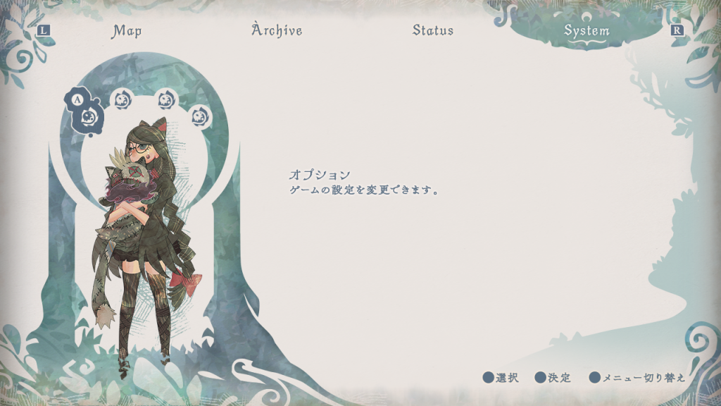 Mock-up illustration
We placed and arranged the character/background silhouettes according to the content of each page, so that even a page without any illustrations could feel as if it belonged in a picture book. We also designed each page to play a part in Cereza and Cheshire’s adventure. For example, on the Helped Wisps screen we show a silhouette of the Wisp itself, while the Journals screen shows silhouettes of Cereza and Cheshire exploring the forest.
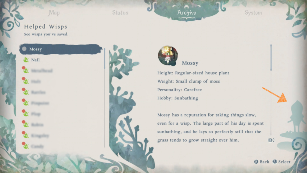 Helped Wisps
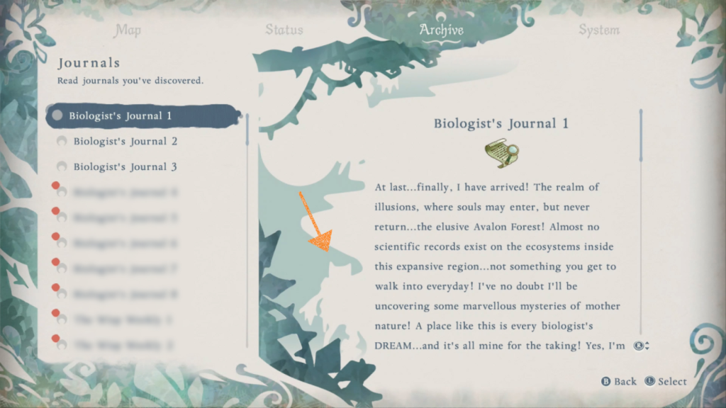 Journals
The silhouette of Cheshire on the System screen is created to move closer as you advance to the Options menu, giving the impression of going back and forth between screens.
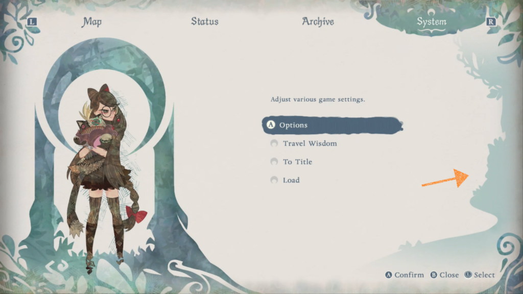 System
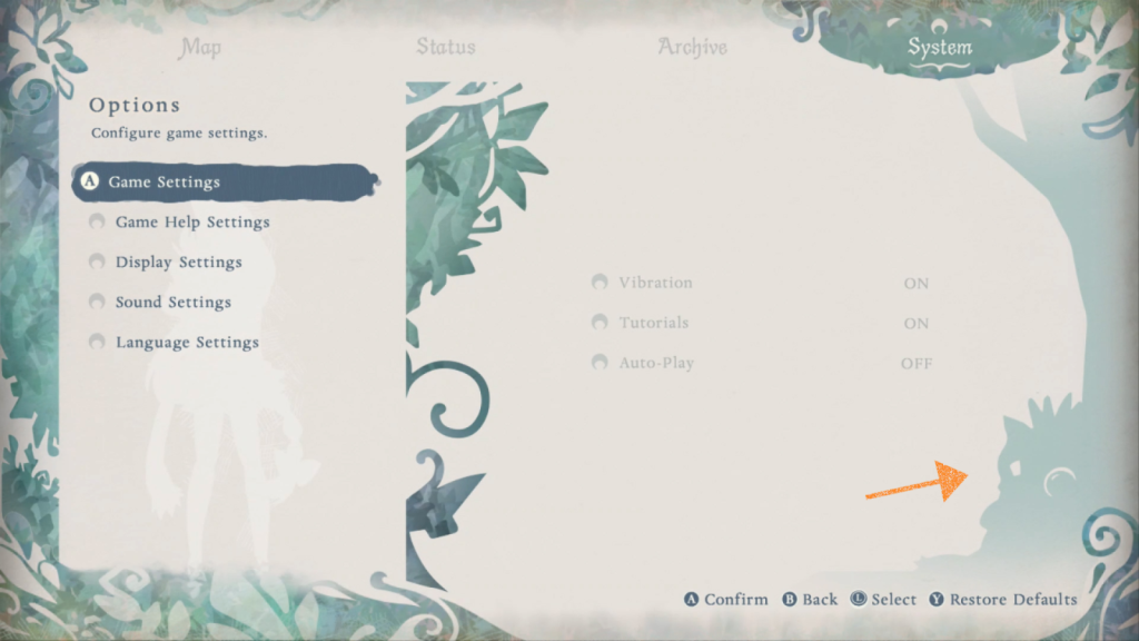 System > Options
We also attempted to bring out the atmosphere of a stylish picture book, with the illustrations and text as the main elements, while also emphasizing the importance of blank space. To achieve this, we kept any sorts of decorations to a minimum and used margins to separate the design elements to create a clean feel across the entire screen.
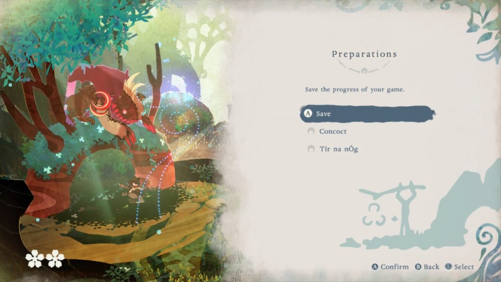 Sanctuary
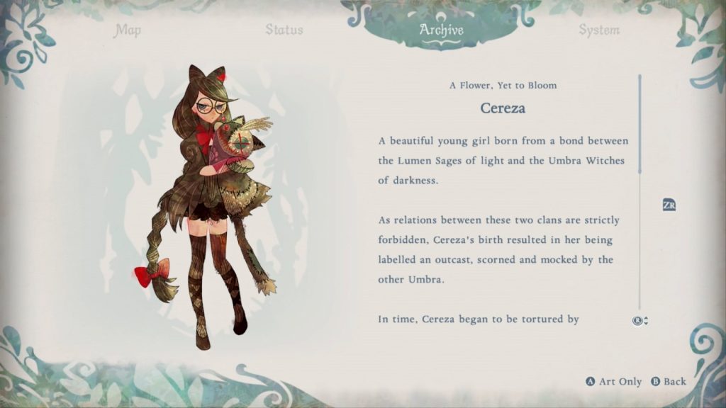 Archive > Characters > Cereza
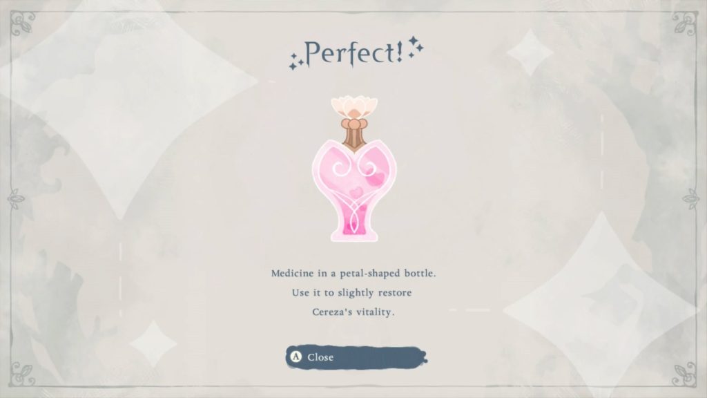 Item concoction
The color scheme changes dramatically according to the story, which is another characteristic that we wanted to express in the picture book concept. The blank spaces are white and the main color is forest green, while the scenario pages are drawn in sepia tone. For Tír na nÓg related content, we used light blue colors to accentuate this portion of the game.
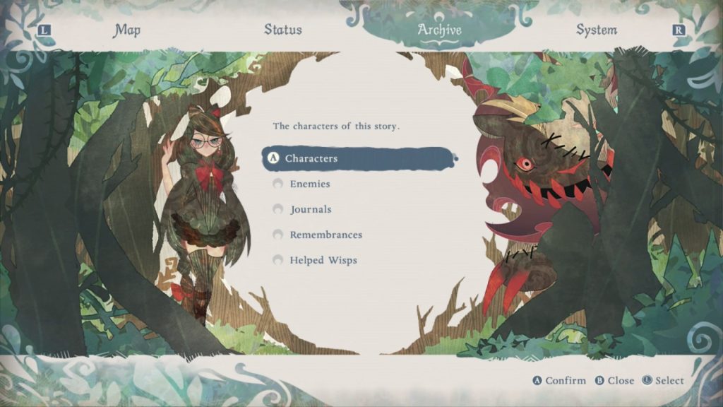 Archive
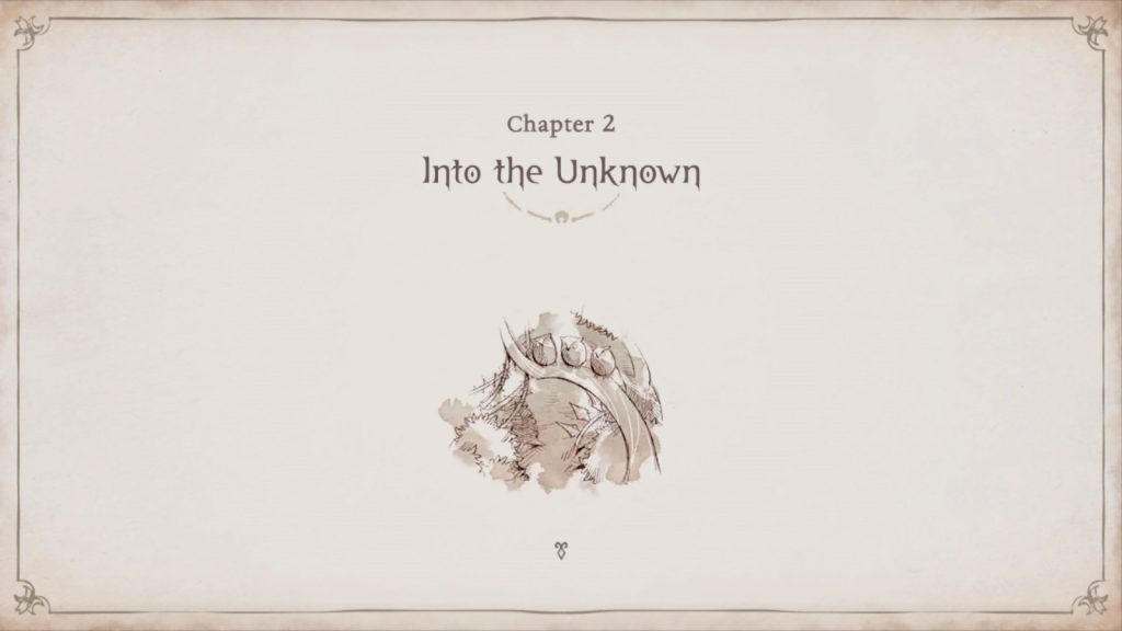 Chapter 2 opening
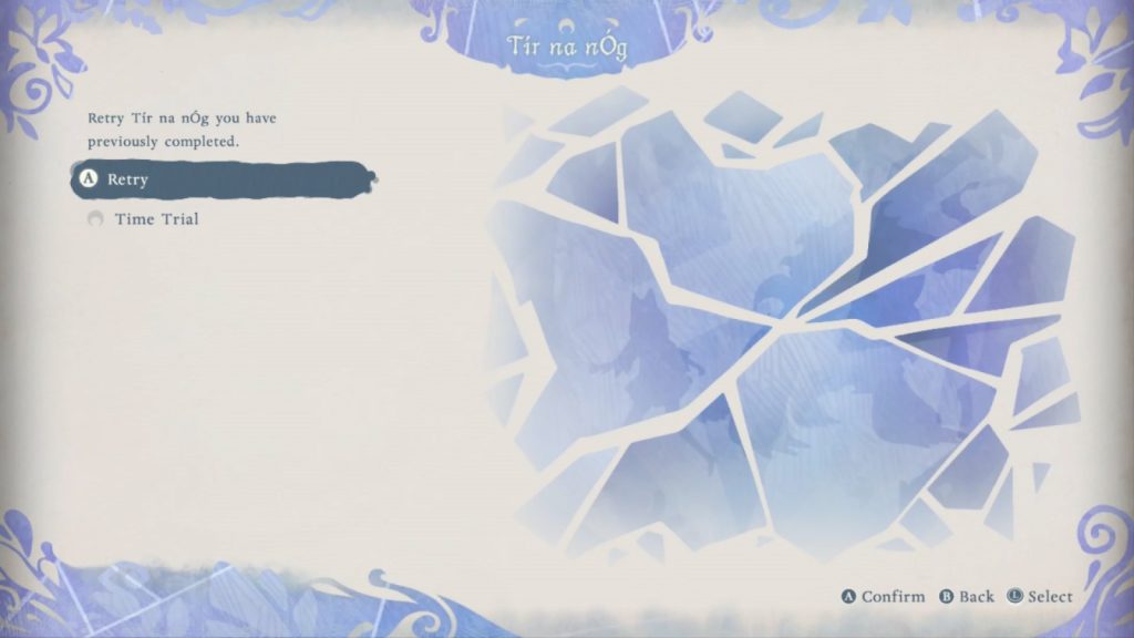 Tir na nÓg
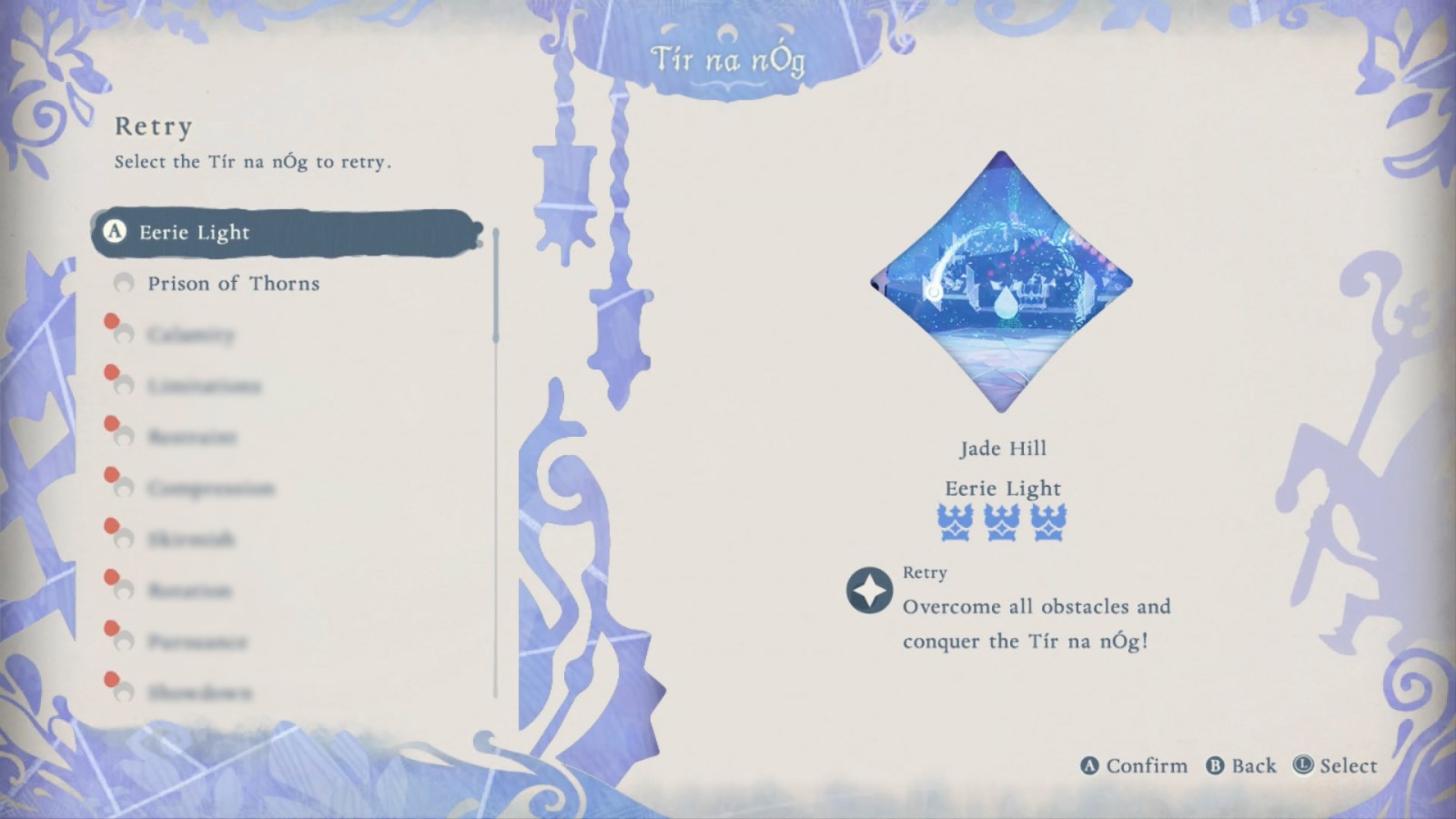 Tir na nÓg retry
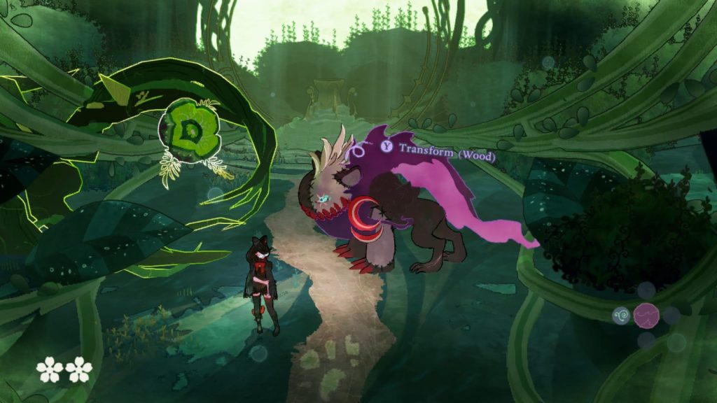
The HUD (heads-up display) is used to display information related to gameplay when controlling Cereza and Cheshire, such as the life gauge and various other gauges, place names, and item acquisition displays. You’ll find that it is also colored in the same manner as the menu screen to create a sense of unity throughout the game and the picture book experience.
The design of the life gauge increase items was created by the art team, but magic capacity was not designed to be increased through items, so we created the gauge for this on the UI team as a counterpart to the life gauge increase. This way the designs could match each other in terms of tone. The design of the attributes is also aligned with Cheshire’s design, and we tried to unify the whole game world by incorporating and expanding the designs of other parts of the game. The colors and placement of the HUD for Cereza and Cheshire were differentiated to express their characteristics and make it easy for the player to navigate.
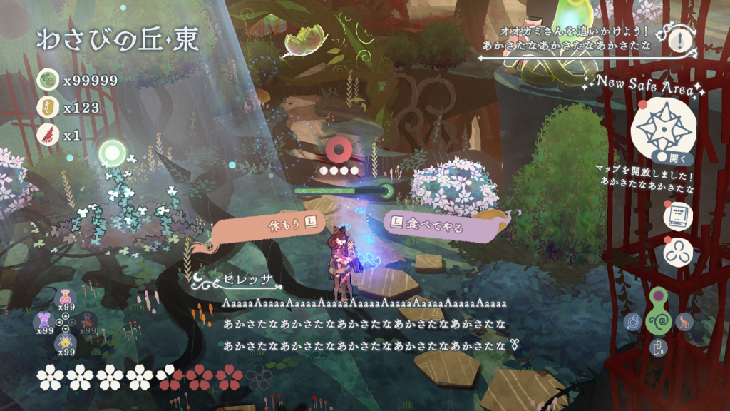
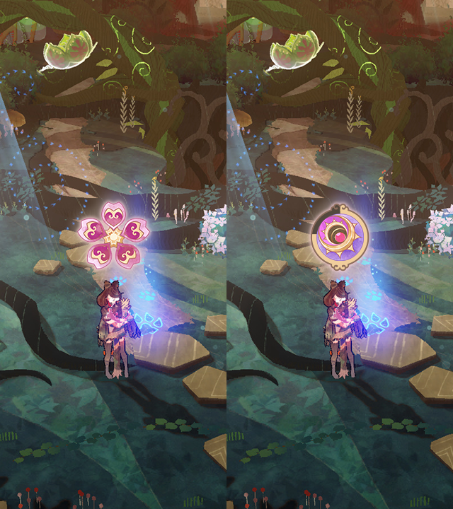 Life gauge increase (L) Magic capacity increase (R)
Let me also talk about some of the finer points that express the picture book concept. The buttons on the gallery screen in the Archive are randomly shaped and the characters displayed on there are surrounded by forest illustrations to give the appearance that they have been directly placed in the menu from scenes in the game itself.
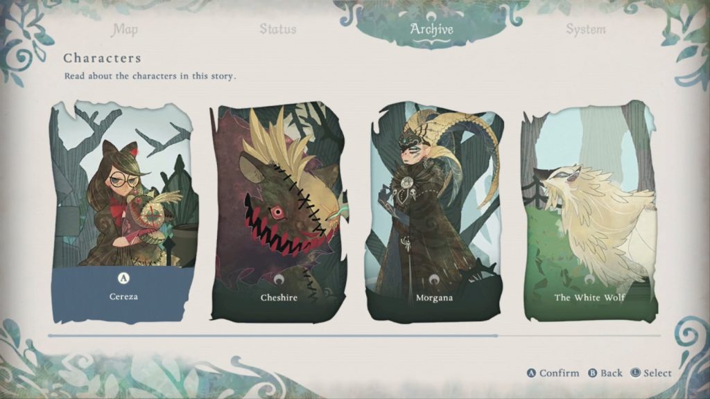 Archive > Character
We drew the world map to illustrate the significant landmarks of each area. The map is studded with Wisps and forest creatures to give it a sense of cuteness even when the locked areas have not yet been opened to the player.
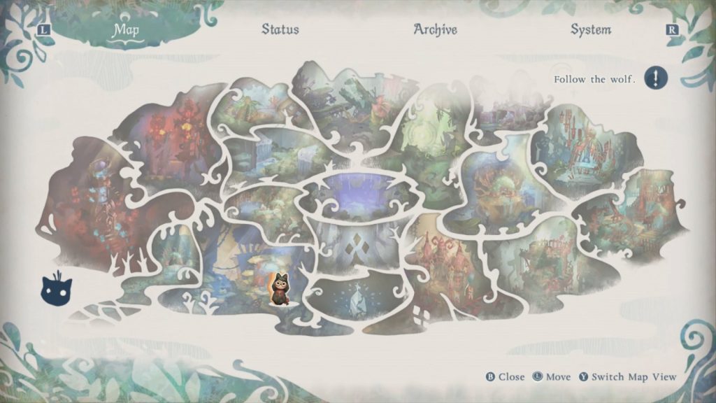 Fully unlocked map
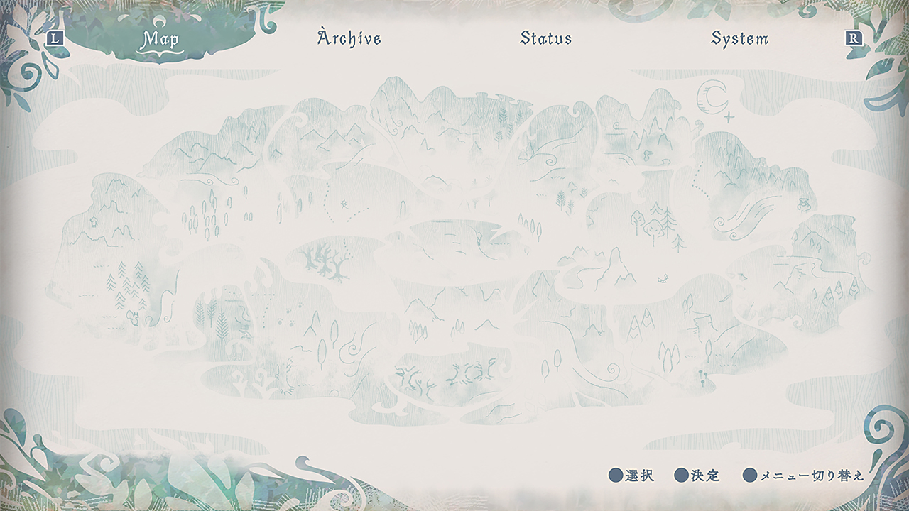 Locked map
We designed the item icons used in the HUD and menu screens with reference to the art itself. We chose to do this in order to improve their visibility as “icons” and to prevent them from being out of contrast with the rest of the on-screen experience. Also, illustrations on some screens will change as the story progresses! I hope that you can check out the illustrations in the game in more detail when you go hands-on!
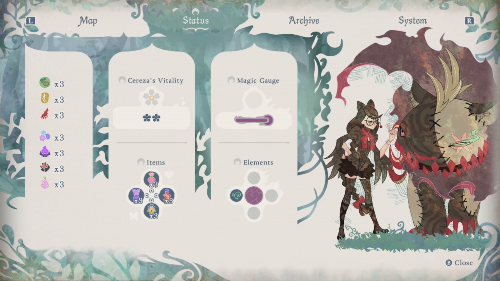 Status
Animating the UI components
We designed the animation of the UI components to fit the picture book concept. As described in the VFX blog (Read the blog here), we also made sure to design the UI animation so that it felt like reading through a picture book. Starting with the page flipping animation when switching screens, we animated the visual components to appear slowly as if they were an actual drawing when the next screen came up. The little icons are also animated as though they are skipping frames in the animation, and it turned out quite cute. We also placed emphasis on 2D visuals rather than the standard game graphics which tend to give off a CG-like luminescence.
In closing…
How did you find this entry? We did our best to make the gameplay as enjoyable and comfortable as possible, even for visual components that would otherwise be overlooked during the gameplay experience. There are many more playful UI elements in the game, so I really hope you will try and find them out for yourself as you play Bayonetta Origins: Cereza and the Lost Demon.
 |
Tomoyuki Kondo Joined PlatinumGames in 2014 as an UI Artist. Worked as the Lead UI Artist on “Star Fox Zero”, “World of Demons” and “Babylon’s Fall”. |