Hi guys, this is K here, the environmental concept artist for Metal Gear Rising. It is my great pleasure to share with you some of the work done for this long awaited game!!
Having played most of the games in the Metal Gear series, I was shocked when asked to do environmental concept designs for Metal Gear Rising. I was overjoyed and extremely nervous at the same time because of the immense reputation of this very franchise!
Being a joint production with Konami there were many hiccups from the start. I came across the environmental designs that Konami did before Rising became a joint venture with Platinum Games. The direction was futuristic, very much more than it was in MGS4.
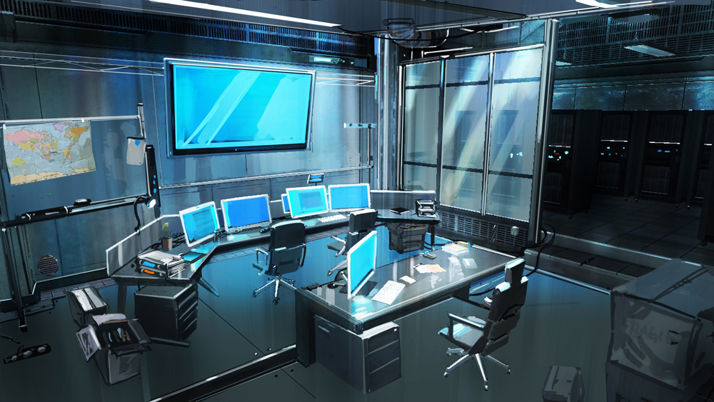
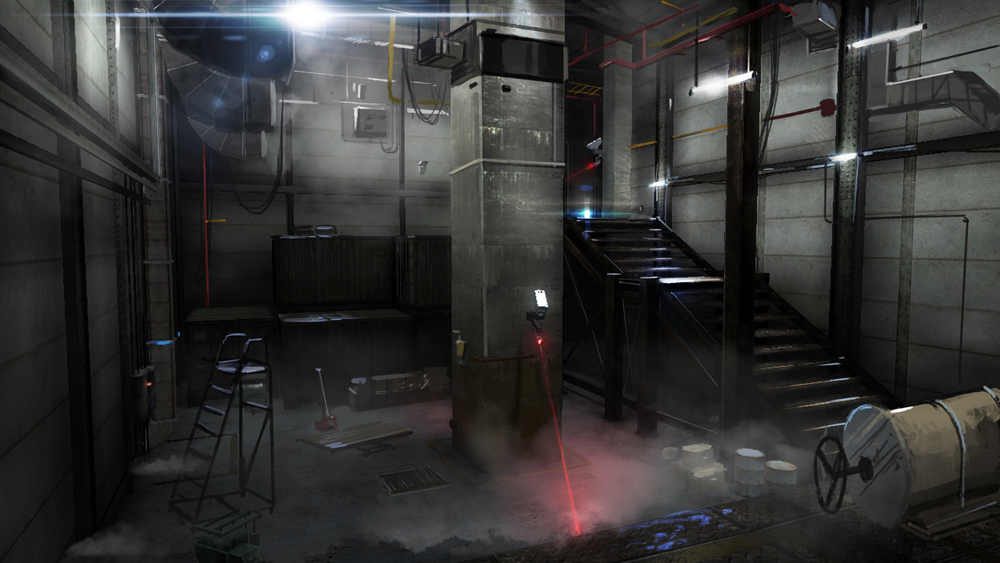
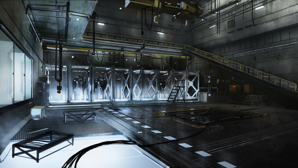
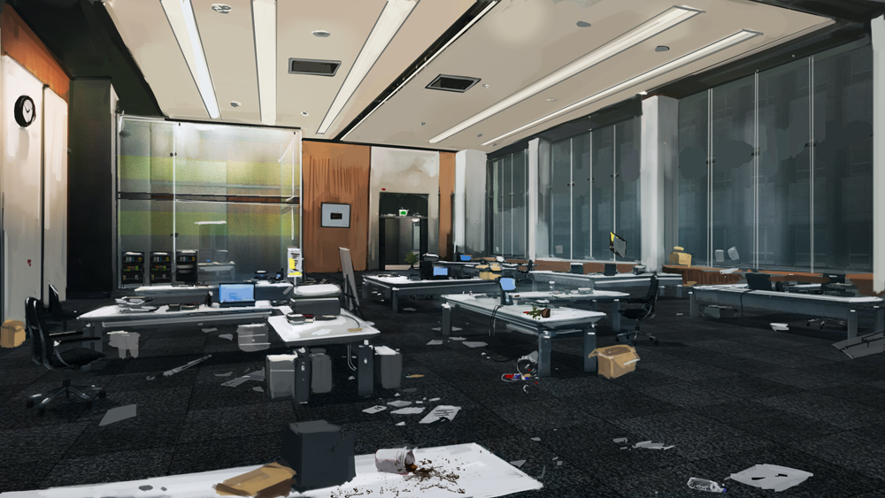
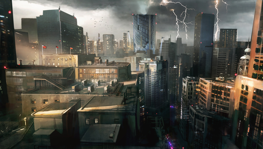
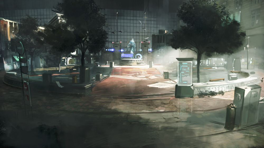
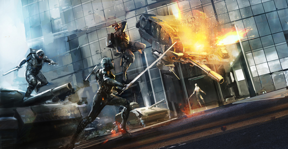
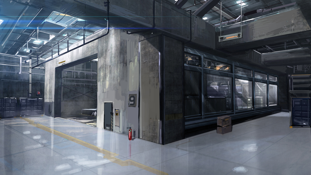
After Platinum took over the development of the project, the direction was shifted to a more modern look. Director Saito-san wanted to shift away from the direction of the previous series, he wanted something more realistic and modern without stepping into the realms of the cyberpunk. The story is pretty much set in non-military locations, meaning that I had to come up with something that would fit the Metal Gear universe and yet be believable. For example, in one of the stages there is this factory(like you always get in MGS), in the usual sense the factory would have been gritty with alot of metal, metal walls, rusty floors etc. Instead, I chose to work with concrete and stainless steel to give it a non-military feel, as well as using LED light panels that glow from underneath for the workshops, just stopping short of making it look all too sci-fi. By working within the philosophy of modern architecture and the characteristics of the Metal Gear Universe, I tried to create a sleek, functional and believable modern world for Raiden to be in.
Of course it wasn’t all smooth sailing from the start. There was great confusion over the art direction of the game initially. Konami seemed keen to try out a new look while Platinum having made several fantasy titles, the style was somehow open and up for grabs. Back then I certainly did think that it would be safer to just fall back on the general direction of the previous MGS titles. For illustration purposes, I have included two ‘before and after’ designs.
Before: This earlier design shown below is bordering on fantasy.
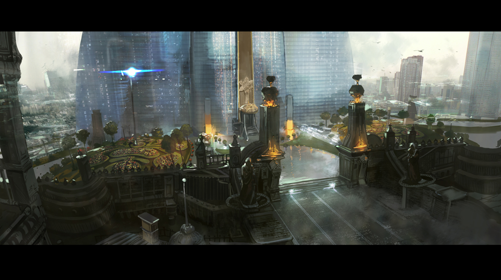
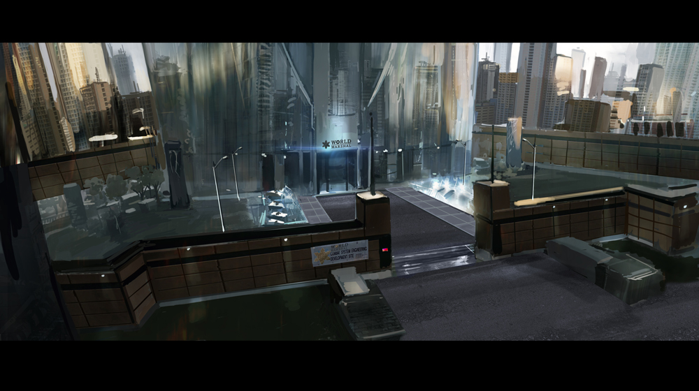
After: A simpler, down-to-earth look more suitable for a military corporation.
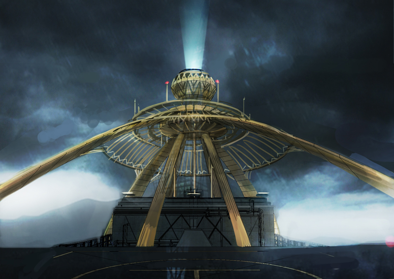
Before: Earlier design of the rooftop deck.
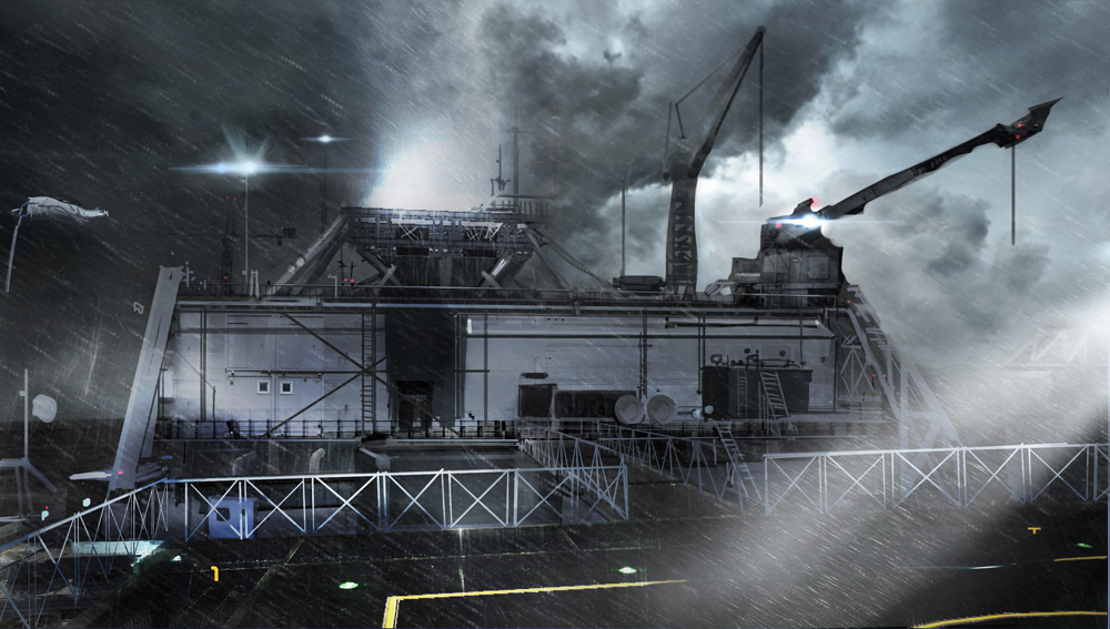
After: Final design is of a more realistic and functional look.
Looking at the difference from earlier designs, it has definitely come a long way from when the project was first announced! Being a project with so much hype and excitement, as well as considering the dynamics of two studios, each with their own distinct individuality, I could see that Rising could have easily been pulled into a totally different direction. It is nice to look back to when nothing was fixed(when i was pulling my hair), and now looking at the final direction we settled on I hope we managed to create a believable world for Rising.
It has been a pleasure sharing my work and thoughts, I thank you for your time and please sit tight til the release in February!
-K