My name is Tomoyuki Kondo and I was the Lead UI Artist on NINJA GAIDEN 4. Today I would like to share some behind-the-scenes insights into the UI that brought this game to life.
■So, what exactly does a UI artist do?
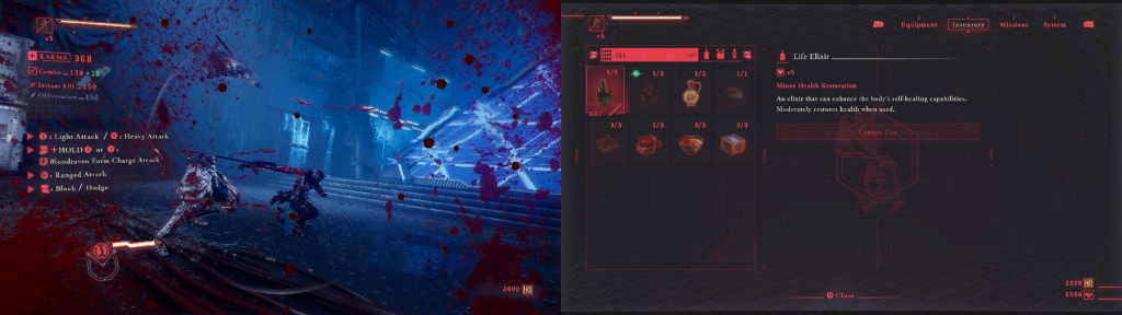
UI (User Interface) refers to the various pieces of information displayed on the screen. Examples include health bars, various gauges, icons, item acquisition indicators, achievement notifications, and menu screens. The main job of a UI artist is to design and implement these elements in a way that is easy to understand and that fits the game’s atmosphere.
Over the past decade or so, the UI field has been gaining more attention, and I imagine that many of you may be somewhat familiar with it. If you find this interesting, I’d be delighted if you also took a look at the articles covering our previous work.
Bayonetta Origins: Cereza and the Lost Demon:
Bayonetta Origins: UI Design
ASTRAL CHAIN:
ASTRAL CHAIN Devblog: The Wide World of UI, Part I
NieR:Automata:
UI Design in NieR:Automata
BAYONETTA 2:
UI Design in Bayonetta 2
ANARCHY REIGNS:
Anarchy Reigns: UI Framework
BAYONETTA:
User Interface Design
■About the Intent and Concept Behind the UI
The UI concept for this title is, put simply, a “sci-fi ninja interface.” Since we had been exploring the theme of a cyberpunk feel from the beginning of development, we wanted to ensure that the UI fit that world setting. Although the game itself doesn’t dive into this aspect in detail, we wanted to create a design that would feel natural in the context of the world.
Specifically, we designed it by imagining the screen of a device that a ninja living in modern society might use. To add credibility to the design, we also created a backstory: “Ninja clans have limited contact with the outside world. While they possess advanced technology, they have evolved independently. Consequently, their UI has evolved while retaining strong elements of ancient Japanese culture.” We incorporated ninja tools and talisman decorations into the UI to express this aspect and create a retro-futuristic look.
I should note that this backstory is purely for the design process and isn’t an official part of the setting. However, I believe that building such backstories to assist with design is one of the most interesting aspects of UI production.
 In-Game UI Design
When I presented this concept to the director and art director, the design was finalized surprisingly quickly. However, reaching that point involved repeated trial and error with color schemes and decorative patterns. The final red and black color scheme we landed on feels perfectly suited to both the “blood” and the retro-futuristic, monochrome, monitor-like aesthetic.
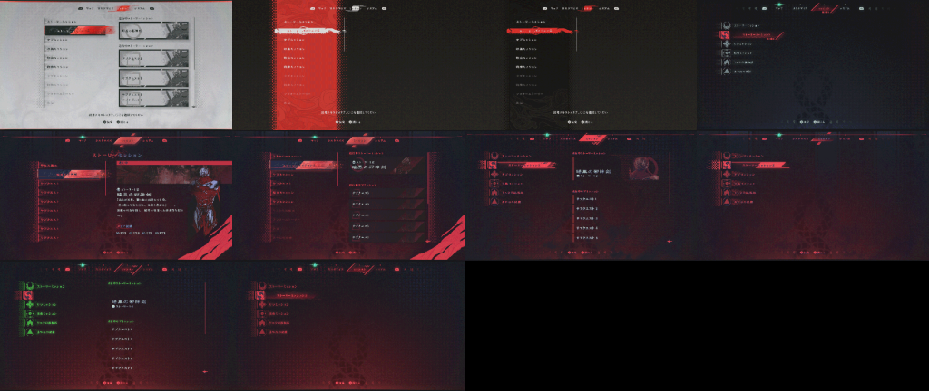 Initial Design Images
 Design Image Just Before Submission
Even after finalizing the concept, we made numerous adjustments to the visuals and colors while reviewing the UI as it was implemented in the actual game. The visual impression during gameplay differs from what you see in still images, so we meticulously adjusted details such as readability, information priority, and keeping from looking cheap.
After implementation, we refined every detail, such as buttons, background designs, the overall color tone, icon color, and custom number fonts.
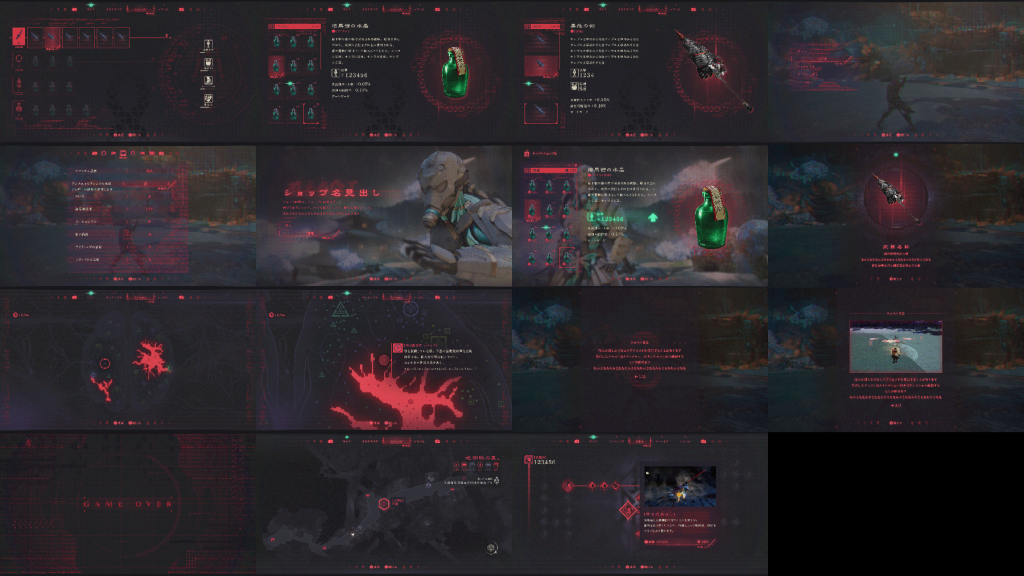
 Design Image at Concept Stage
 Post-Implementation Image
■UI Animations
This game’s UI animation heavily employs the “ease-out” technique, which creates a natural and pleasant impression by quickly starting movements and gradually slowing them toward the end. Additionally, animations that span the entire screen are designed to be slightly longer when appearing and shorter when disappearing to ensure smoother transitions.
Furthermore, when the player highlights buttons, they gently move back and forth and have decorative loop animations to make them stand out on the screen and allow for clear distinction between moving and static elements. We designed it this way to facilitate natural visual guidance.
We also incorporated various techniques for other effects. While most of these effects weren’t specified to us, we added them in to make the time spent interacting with the UI more enjoyable.
For instance, during screen transitions, we use designs such as dot patterns, distortion, and screen curvature. This concept stems from the idea that this ninja device is not a commercial, off-the-shelf product, but rather something uniquely crafted. This creates an effect where the screen appears unstable during transitions.
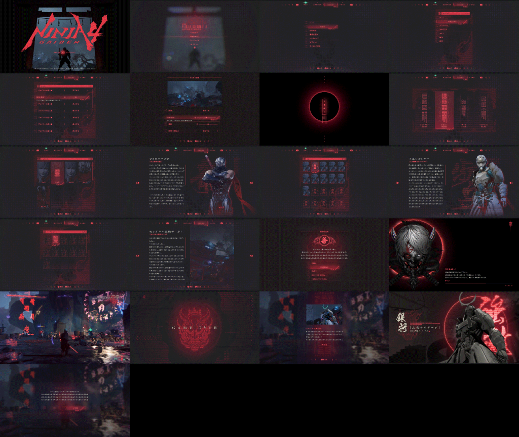
Main Menu Transition Animation
The main menu features grid-like decorations arranged vertically. Animating these decorations forward and backward adds depth to the screen.
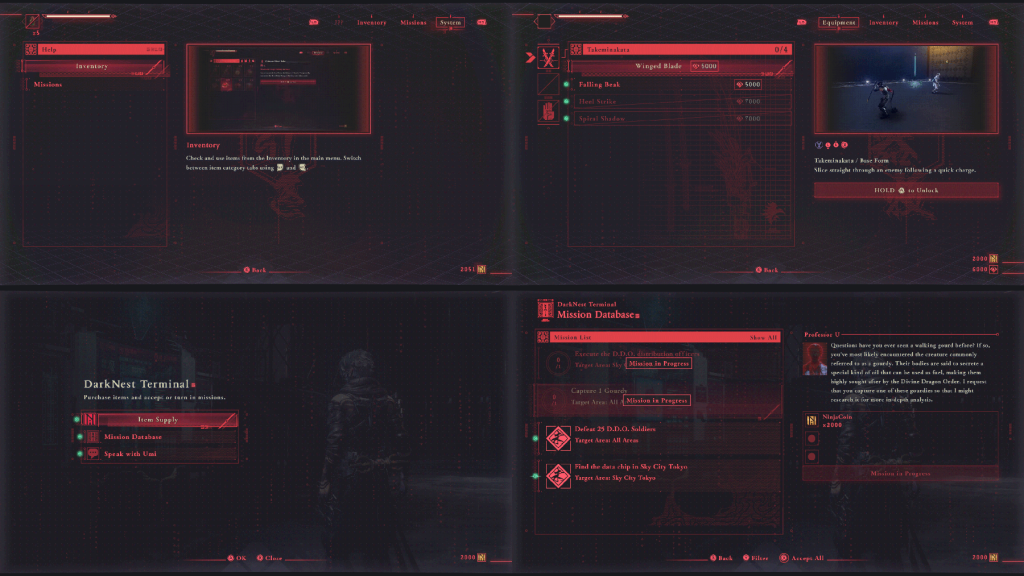
Inventory Screen Animation
The ” Equipment” screen features an animated, rotating human diagram that evokes an image of ki energy flowing through the player character’s body, emphasizing the cyber aesthetic. Additionally, the pointer position on the diagram moves in response to the cursor location, creating a more interactive feel.
Equipment Screen Animation
On the NPC menu, each NPC’s unique mark is combined with a data-loading gauge to create a cyber aesthetic.
NPC Screen Transition AnimationWhen displaying the “Purgatory” screen, we incorporated an animation of text scrolling vertically, as in a sci-fi movie, to create a unique, cinematic presentation.
Purgatory Transition AnimationAs for the result screen that displays after a stage, we added an animation where a band overlays from the top and bottom of the previous screen. Along with this, a visual effect meant to evoke the idea of “accessing a database” was added to clarify that it’s the end of a chapter.
Result Transition Animation■Small details within the UI
We’ve also incorporated various subtle details throughout the game. Here are a few examples:
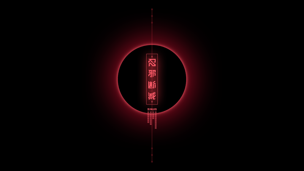
The four-character idiom “忍邪断滅” (Nin-Ja-Dan-Metsu, roughly translated to, “remain hidden, eradicate evil”), which is briefly displayed on the main menu, is an original phrase that expresses the mindset of a ninja.
 Four-character Idiom Displayed in Main Menu Transition Animation
We utilized Japanese text designs frequently within the menus to convey the image of a device coded in Japanese. The flowing decorations above and below overlap with the game’s rain theme, creating the impression of rain flowing across the menu screens.
 Decorative Elements Representing Japanese Coding
In the HUD notification display animation, a small detail worth noting is the kunai that flies by if you look closely.
Kunai in HUD Notification AnimationFurthermore, illustrations of Yakumo’s eye used in various effects pay homage to the cut-ins from the classic 2D “NINJA GAIDEN” games.
Designs within the Effect Animations that Mimic Cut-ins■Designs Beyond the UI
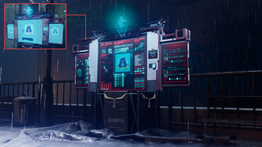
I was also involved in a wide range of non-UI design work. For the monitor design displayed on the shop screen, I volunteered since no one was assigned to it at the time. Although it wasn’t officially requested, I envisioned sci-fi movie monitor graphics and created an information-packed design. Players will see it frequently, so I believe it helps establish the game’s atmosphere.
 Shop Monitor Before and After Design
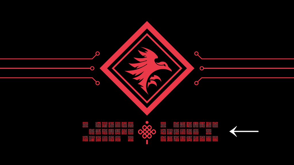
I also created the clan crests. I used a diamond as the Raven Clan’s motif and circular silhouettes for the Hayabusa Clan’s to make them distinct from one another. I consolidated them into dense, crest-like designs that are recognizable even from a distance.
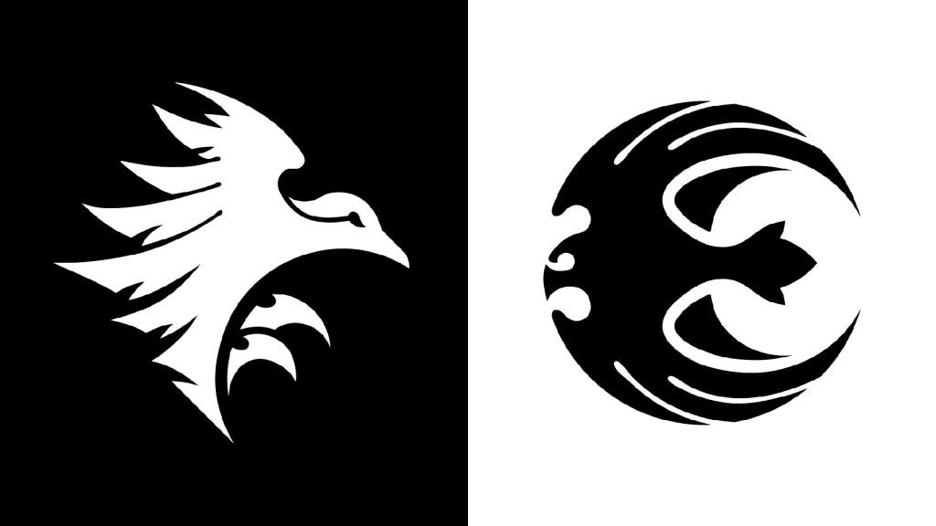 Raven Clan and Hayabusa Clan Crests
The enemy organization’s emblem was also designed by me. By transforming the kanji character for “dragon” into an inverted triangle silhouette, I think we achieved a balance between a cyber aesthetic and a traditional Japanese feel.
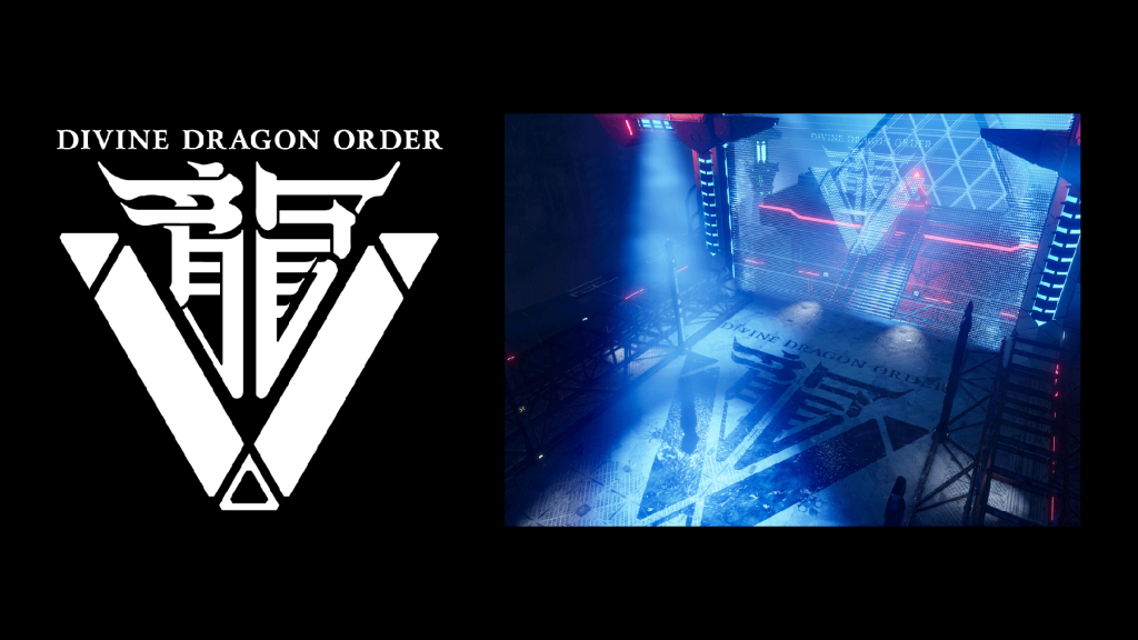 Divine Dragon Order Emblem
Additionally, we created symbols used within the story. We incorporated motifs from the Chinese zodiac and eye-like iconography to give the design an ominous feel.
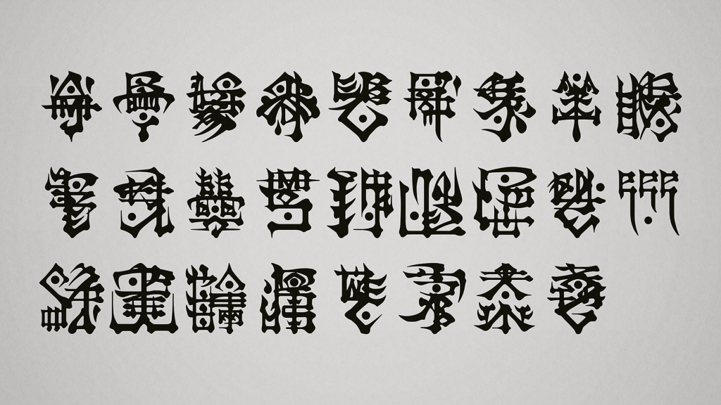 Symbols Appearing in the Story
■Conclusion
What did you think? The UI for this title attempts to achieve clarity and utility, and incorporates various concepts from the game’s world setting. Since the game hasn’t launched yet, I wasn’t able to show off some of the features, but I hope you’ll play the game and experience the ending for yourself.
Have a great master ninja life!
 |
Tomoyuki Kondo Joined PlatinumGames in 2014 as a UI Artist. Worked as lead UI Artist on multiple titles including “Star Fox Zero,” “World of Demons,” “Babylon’s Fall,” “Bayonetta Origins: Cereza and the Lost Demon,” and our latest release, “NINJA GAIDEN 4.” |